
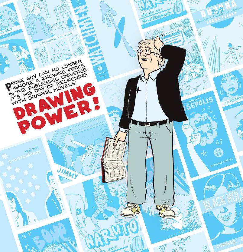
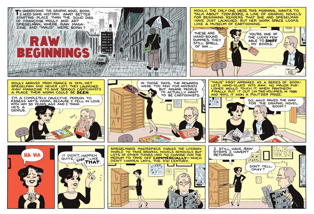
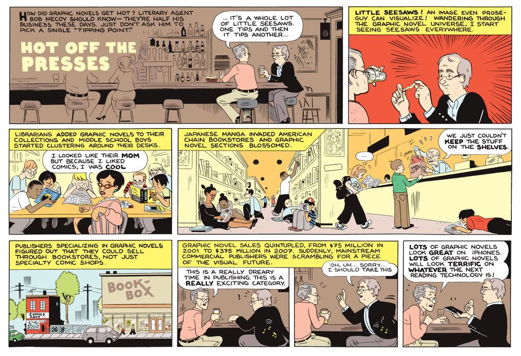
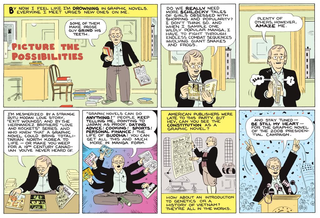
I'm posting my own optimized jpgs of a few comic strips I drew for this weekend's Washington Post.
They printed okay, and its exciting to see it printed on newsprint in full color, but the WP online translation is kind of hard to look at. Maybe this will look a little bit better. The strips were written by Bob Thompson, the author of the piece. Possibly the most fun I had was drawing my own versions of other peoples book covers for the cover illustration (above). Click on the images to view them larger.
Monday, August 25, 2008
Drawing Power.
Sunday, August 24, 2008


Thursday, August 14, 2008
Unabridged
Courtesy of the Peanuts Collector Club FAQ
It Was A Dark And Stormy Night
by Snoopy
Part I
It was a dark and stormy night. Suddenly, a shot rang out!
A door slammed. The maid screamed.
Suddenly, a pirate ship appeared on the horizon!
While millions of people were starving, the king lived
in luxury. Meanwhile, on a small farm in Kansas, a boy was
growing up.
Part II
A light snow was falling, and the little girl with the
At that very moment, a young intern at City Hospital was
making an important discovery. The mysterious patient in
Room 213 had finally awakened. She moaned softly.
Could it be that she was the sister of the boy in Kansas
who loved the girl with the tattered shawl who was the
daughter of the maid who had escaped from the pirates?
The intern frowned.
"Stampede!" the foreman shouted, and forty thousand head
of cattle thundered down on the tiny camp. The two men
rolled on the ground grappling beneath the murderous hooves.
A left and a right. A left. Another left and right. An
uppercut to the jaw. The fight was over. And so the ranch
was saved.
The young intern sat by himself in one corner of the
coffee shop. he had learned about medicine, but more
importantly, he had learned something about life.
THE END

Wednesday, August 13, 2008

Tuesday, August 12, 2008
Cartoon Appropriation
 In a Barnes and Noble a while back, I was flipping through a thick, glossy, and expensive art/fashion magazine and came across a feature titled “Moonlighting,” a kind of implied narrative that alternates between stylized S&M-like photographs and minimalist cartoon drawings. The piece (called a “site-specific insert” by the magazine) was credited to Swiss artist Ugo Rondinone, but the drawings looked just like those of the Norwegian cartoonist Jason, who I assumed was a collaborator. As I looked more closely, however, I began to realize that the cartoons were altered and redrawn images from one of Jason’s graphic novels, Sshhhh!
The two-page spreads in “Moonlighting” typically have a photo and a drawing that each take up a full page and are placed side-by-side. Here are two representative pairs:
1. 
 2.
2. 
 The magazine’s art editor offers the following commentary and interpretation as a set-up to the piece:
New York-based mixed-media artist Ugo Rondinone is a master of appropriation. Either by looping footage from Antonioni or Fassbinder to atmospheric soundtracks, building minimal "Sol Lewitt"-style sculptures or placing his own face into famous fashion editorial spreads, his work comments on the omnipresent cultural re-formulation and recycling so often found in contemporary art. Rondinone takes us on a journey of an unhappy cartoon raven set against a bakkdrop [sic] of black-and-white rubber suit images reminiscent of S&M and sexual fetishes. By contrasting these obviously oppositional contexts, Rondinone’s critique is even more explicit, a reference to the impossibility of creating a stable identity in an ever-changing, completely "renewable" society, where anything and everything is possible.
This language echoes the ways that many art critics have talked about Rondinone, emphasizing his appropriation of celebrated artists and filmmakers (who are usually always named), his use of pop culture detritus (such as cartoon animal drawings - whose artists are typically not named), and his destabilization of aesthetic and identity boundaries and categories. The editor’s phrase “oppositional contexts” (and the boundary blurring that it supposedly creates) refers to the division of the work into a sequence of photos and drawings, as well as oppositions such as clothed/naked, night/day, human/animal, erotic/mundane, etc . . . Yet, perhaps the name-dropping (Antonioni and Fassbinder) and name-withholding (Jason) reinforces, rather than blurs, a familiar opposition (one unremarked upon by the editor): high art and low art, which is here connected to the binary of credited/un-credited. Why drop Jason's name if it won't give you any fine art cred? And that assumes, of course, that you are familiar with his work in the first place . . .
Here are some of the images and source panels:
A.
 B.
B. [Note some of the odd choices Rondinone makes in the redrawn image above as compared to the source below, in particular the way the wine bottle becomes more like a chunky milk bottle and the disappearance of some of the chair's legs -- and those that remain seem splayed.]
 C.
C. [Note the differences in the lines that define the walls, which seem rather loosely and unevenly drawn above. Jason's lines are simple and relaxed, but they are always carefully executed.]
 D.
D. 
 E.
E.
 I would argue that Jason is not only the master appropriator for his idiosyncratic blending of elements of funny animal, horror, and slice-of-life comic book traditions, but that his work already contains within it a series of “oppositional contexts” that truly destabilize the kinds of categories that the editor claims are undermined by Rondinone’s approach. The majority of the oppositions in “Moonlighting” are already fully at play in Jason’s work, as well as many others: clothed/naked, night/day, human/animal, erotic/mundane, quotidian/horror, stasis/drama etc. And much of Jason aesthetic -- and his humor -- comes from the ways that he seamlessly moves between contrasting genres and expectations with a consistently deadpan sensibility. “In all of Rondinone’s work,” one critic claims, “the artist is interested in disrupting boundaries”; yet the alternating structure of “Moonlighting” tends to keep many boundaries intact; I like “Moonlighting,” especially for the way it combines two narratives whose relationship is evoked but never clarified, but it also seems a little heavy handed, especially when compared to some of its source material.
These are two of the source pages for the panels in “Moonlighting”:
1. I like the way that this gag about the couple's living situation works; in the beginning of book, the animal characters are almost completely humanized, so we are surprised to see that the protagonist lives in a nest. Yet this reversal of logic gets modified again when we see the couple realize that the nest will not work, and so they select an apartment and look less than excited about it. (Are they wistfully looking out at the nest in the last panel?) Nothing in "Moonlighting" seems as interesting as this.
2. Here the horrors of everyday life -- the almost oppressive weight of mundane activities -- intertwine with ominous yet comedic panels of a newspaper-carrying skeleton, who seems passively to haunt the main character, perhaps as a reminder of a tragic event we have witnessed earlier in the story and others to come. This is also an unusual, non-scatological take on "bathroom humor": why is the skeleton in there -- does he just use the bathroom as a place to read? And it seems funny to me that the bird character doesn't need to take his pants down . . .
Perhaps Rondinone was attracted to Jason's work because of its interest in everyday life (a concern of the Swiss artist), and its deep sense of stillness, repetition, and pathos (as seen in this page from Jason's Hey, Wait . . .) 
all of which it somehow maintains while at the same time being gently (yet not always so) comic:
 Even the titles of these two novels -- Sshhhh! and Hey, Wait . . . -- suggest some of the sense of quiet and slow pacing that are hallmarks of much of Jason's work.
Coda:
Carl Barks certainly appears to have been an influence on Jason's work, and we can see some of Jason's appropriation of the famous Donald Duck/Scrooge McDuck artist in these images from a Gyro Gearloose story. Here is Jason's main character followed by Bark's Gyro:

 And here are typical background characters, who often seem more blandly human, particularly in their dress, than do the protagonists:

Other Blog Flume "Side-by-Sides":
Miriam.
Roy Lichtenstein.
Friday, August 8, 2008
Fine Art.
Found on a cluttered table set up on 23rd street covered in pieces that ranged in size from 2 inches square to about 10 inches square . The many paintings featured a variety of cartoon characters, often engaging in sex acts. Popeye and Olive Oyl, Blondie and Dagwood, even The Little King (he doesn't wear underpants) were among the appropriated work. A few pieces jumped out and surprised me. Direct transcriptions of Ivan Brunetti's Schizo panels in acrylic paint on little stretched canvases. Here are scans of the two "Ivans" I picked up.


Subscribe to:
Posts (Atom)
