|
| (Photos: Y. Yeto) |



I scanned this clipping because it reminded me a little of events depicted in Wally Gropius. Some fellow stole a 1.4 million dollar tax refund check--doesn't say how--from a real estate magnate--apparently the 45th wealthiest man alive--then impersonated said magnate to deposit the check at a bank. The funniest part is the suspect listing "smoke shop" as his occupation on the paperwork.
Also in the news, I recently appeared on the radio program Inkstuds. I note this mostly because my coworker Jim Ellwanger created 4 amazing 5-minute medleys from his collection of radio jingles for the breaks. Listen to the battery in my phone die!
 Tim Hensley’s Wally Gropius was released a week ago, and while I closely followed the story during its Mome serialization, the book (which has many new pages) is a whole nother thing. It has quickly become one of my favorite graphic novels. Here are some reasons why:
Parody and/or Something Else?: It’s Hard to Describe
What is it? Is it a parody? Maybe, but Hensley’s sense of parody is so original that it’s difficult to characterize the book or his approach. Wally Gropius is formally and thematically parodic in that it imitates visual, character, and plot conventions of Dell, Harvey, and Tower teen comics and children’s comics. For example:
The “teen comic that never misses an opportunity to pun” -- like Harvey’s Bunny (one of the “Blog Flume’s Top 50 Comics”) or dozens of other 1960s comic books. (Click on images to enlarge.) The “male teen pop star pursued by countless female fans” -- like DC’s Swing with Scooter and many others.
The “omnipresent visual money pun” -- objects in the shapes of money symbols -- which, of course, come from Richie Rich. (“Cola Silo,” I assume, is an allusion to Uncle Scrooge’s Money Silos.)
The “adult condescension toward teenage habits” -- from every teen comic ever.
The familiar character types and drawing styles -- from comics like Richie Rich, Ponytail, Thirteen Going on Eighteen, Tippy Teen, Beetle Bailey, etc . . .
And the libidinal/obsessive energy present in Harvey Comics, Archie, and countless teen comics is taken to a disturbing place -- taking the “grope” in “Gropius” to new highs and lows.
In this last instance, Wally Gropius is the kind of parody that works as commentary on the earlier material, by exposing, in an exaggerated yet insightful way, energies/ideologies that animate the source comics [more on this later]. But this, too, oversimplifies things . . . The comic is too odd to be described as “commentary.” It seems far more synthetic than parodic: it blends recognizable influences into something truly new (I always avoid the word “truly,” but in this case it’s needed). And yet, it’s not that far from being a teen comic -- remove a few scenes, a few words and it’s kind of “tween friendly.” It’s hard to describe.
Sensical or Nonsensical?
The dialogue and scenarios are often weird/absurd, but they always make sense; they can easily be understood as exaggerations of, or skewed takes on, typical tropes of kid’s comics. The plot of Wally Gropius has been described as surreal or random, but it’s coherent and far more complex than I first thought, especially when I read it during serialization. You’ll likely need to read it few times before you can understand how some of the characters, such as Plenty, fit into the narrative, and how Banks and the reporter are connected. The apparent sense of absurdity might distract an inattentive reader (I include myself in this group) from the fact that things fit together in very specific ways.
The Joy of Drawing
The book is an encyclopedia of cartoony facial expressions and bodily gestures, and should be studied at the CCS as such. WG radiates a real sense of joy, of “cartooning unfettered.” The visual surfaces -- bold colors, elegant compositions, and assured inking -- are extremely inviting. Enjoy the faces and hands in this sequence: The Ludic Punisher
Puns rule, both visual and verbal. Take the subtitle, for example: “The umpteen millionaire” -- Wally is a “teen millionaire.” The “ump” in umpteen foreshadows the many sports jokes/puns, which all seem to stem from the Huey Lewis’s “Sports” album conceit, a metaphor that pervades the comic. Umpteen also oddly modifies “millionaire” (traditionally what comes after umpteen must be a plural noun) in that Wally has umpteen millions in the bank. (And umpteeen just sounds funny). [See another Hensley ump joke here.] See also the back cover’s riff on Ox, Fort Knox, Babe the Blue Ox, and “olly olly oxen free.”
Writing and the Logic of Saddest and Married
Hensley is one of the best, and most idiosyncratic, writers of text in comics. Toward the end of the novel, Wally launches into a brilliantly executed disquisition on the linguistic and logical problems of marrying a girl who also must be “The Saddest Girl in the World.” A compelling interrogation of “the limits of language” by a recently-pummeled teenager millionaire at his wedding; and it’s also brilliantly staged by Hensley. Allusive Density
Part of the fun of rereading is finding more puns and allusions, such as the images and literary references to suicide -- Mishima, Sylvia Plath, Goethe’s The Sorrows of Young Werther. It’s a web of allusion, jokes, and puns about things that are funny, and things that aren’t . . . The constant visual jokes also recall the side-features in kid’s comics that asked readers to find the dozen eggs -- or the like -- in a single drawing. Money-pun in lower left corner: "Penny pinching"? "Money’s tight"?
Quote Ability
Hensley creates unforgettable phrases that, if there’s any justice in the world, will appear in all of the best quotation dictionaries: “The Book as Art Object”
Like Clowes with Wilson and Ice Haven, Chris Ware with Jimmy Corrigan and recent Acme Novelty Librarys, or Seth with George Sprott, Hensley in Wally Gropius has exercised careful control of every aspect of the book’s design, creating a beautifully designed object that seems strangely modern while clearly showing its debt to earlier forms, such as the European album format of Tintin collections:
 Note the band across the front cover with the subtitle and the head of the main character (the red-headed Wally is Archie [freckles] + Tintin [rouge cheeks]), and “Hensley” is placed where “Hergé” would be; also note the style of the encircled page numbers). For all of Hensley’s interest in past comics, there’s little that’s really nostalgic about the book and its design. Though it gives off a comforting sense of familiarity (evoking the thick covers of a beloved children’s picture book), this feeling is challenged by the book’s at time uncomfortable contents. And the peculiar clarity of Hensley’s drawing and inking on the cover -- and a phrase like “the umpteen millionaire” -- instantly tell us that we're not in Riverdale.
Sex and Sublimation
Gropius tells a strange story about sexual desire and sublimation. One of Wally’s songs argues for teenagers redirecting their urges into a sport (there’s that metaphor again), in this case a marathon ping pong session that must end in frustrated teens spewing vomit, which perhaps functions as a “surrogate oral ejaculate”: the body will ‘out’ its desire in some way. This part of the narrative about human nature and self-censorship -- like much of the book, really -- lives on the edge of cartoony comedy and disturbing revelation. The book’s approach is all the more profound because it blends ‘funny’ and ‘upsetting,’ such as when Jillian beats the shit out of Wally: it's a "boy meets girl, girl beats boy" story . . .
The book deals with many such “issues,” and could be read in a number of “serious” ways: as parable about celebrity; a meditation on female suffering, histrionics, and culture (or a reimagining of teen Sturm und Drang in the “Bieber-fever” media climate of the early 21st century); a critique of beliefs underlying the popularity of sports and connection between sports and patriotism (or an exploration of a nationalistic sentimentalism); a harsh critique of misdirected mothering; etc . . . While I think it’d be fine to see the book as “about” these things (as a parody that criticizes or even mocks some of its subjects), this approach also seems misrepresentative. . . There’s a weird tension between the book’s appealing surfaces and its “content” that disrupts attempts (at least my attempts) at generalizing about the comic. As Hensley recently said at the LA Times blog: “I have a love/hate relationship with those old comics. There are things about them I'm nostalgic about, but there are things about them that infuriate me as well.” These conflicted feelings play out in the book.
Each Panel / Page is Beautifully Designed The book’s size (printed larger than it was in serialization) is a real plus in drawing attention to the elegant, uncluttered panel compositions.
Hensley’s Skill as a Letter and Title Designer Color and Space
A while back, I wrote about a number of other things I liked about the comic: http://blogflumer.blogspot.com/2009/09/gropius-in-space.html
Other Highlights:
+Best use of photo/drawing collage since Fantastic Four Annual 3.
+Oddest Abu Ghraib allusion, one that makes sense in the context of the previous panel’s images and reference to patriotism and sports. +Most Disturbing Scene of Extispicium in a Teen Comic.
Eight Sources For Further Study:
1. Eric Reynolds Interviews Tim Hensley at the Flog
2. Gary Groth Interviews Hensley in Mome
3. Amazon Message Board Interview
4. Five Questions for Hensley at the LA Times Blog
5. Daniel Clowes on Wally Gropius at The Daily Beast
6. Dash Shaw on Wally Gropius at Comics Comics
7. National Anthems
8. Huey Lewis and Sports
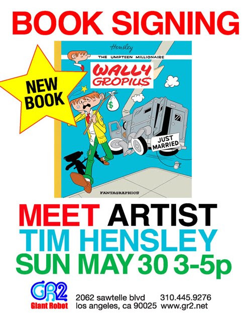
This Sunday, there's a can't miss event. Unfortunately, it's across town at Cinefamily and starts exactly when the event I'm now attempting to promote ends! Oh, well, I'm pretty sure my parents will still show. Come one, come none--there may not be another event like it for quite a while.
Printmaker Jordan Rae sent me this lo-fi work-in-progress photo this morning; he's printing a black velvet poster out of my salute to Successories. The remaining black flocked portion runs along the lines of an elementary school glitter and Elmer's project. Jordan explained he has to add black shavings to a sticky ink base, possibly using a DDT-type sprayer and hazmat set-up of tarps last seen on the TV show Dexter during disembowelment. Wish him luck! The end result will be on sale Sunday. He's also working on some other artist prints which he plans to sell online.
Finally, last weekend's Silverlake Jubilee street fair was something of a wash. The patrons seemed most interested in the traffic jam of amuse bouche fusion trucks lining the street. These upscale "roach coaches" are a craze in L.A. at the moment, with people monitoring Twitter feeds to discover transient locations to line up for Kimchee sliders. If we had had a bookmobile and some vegan stroopwafels, we might've been in business. During our downtime though, Ted Stearn, fellow Mome employee currently among those carrying the serial burden, drew this funny version of Wally, no longer "waiting for a flood."


For a long time I had saved among my paperwork a xeroxed rant of the type usually found stapled to telephone poles that was given to me by my friend George Woods. His girlfriend at the time worked downtown under what was then the B of A skyscrapers in a mall bookstore and was given multiple copies by the author himself, a Balwant Singh Choudry. I've always enjoyed the neural telemetry and meticulous/hopeless documentation found in these sort of tracts. It's as if the author feels so forsaken that he overcompensates by imagining he is under relentless scrutiny. At the end of 2006, a decade after receiving the screed, I decided to illustrate it for the anthology Kramers Ergot 7. Because the book's page size was that of a broadsheet, I tried to replicate the hideous gradient fills found in modern Sunday newspaper coloring. There's also my usual lifts, this time from Woody Allen, B.C. and brethren, and Prinzhorn Collection psychiatric art. I'm sure the likeness is not even close.
It reminds of when I worked in the complaint department at a computer company, and someone wrote in that their laptop had been stolen by the FBI/CIA/Catholic church and also mentioned deployment of a time machine. As a joke, I prepared a form letter, a portion of which read, "We do indeed have your laptop." Obviously, that wouldn't have been a good reply. I still hope Choudry would enjoy this comic, though I suspect he is no longer among us.


Adrian Tomine sent me this image and asked if I could imitate the lettering. This was the original cover to Black Blizzard, but was not drawn by Tatsumi. Adrian also said he wanted the title to resemble a pulp paperback. I was thrilled and slightly puzzled to get the assignment.
I looked through an old Speedball lettering manual and found an alphabet whose characters were vaguely kanji like.
This was the first sketch.
Next was pencils and inks. The outline was in case Adrian wanted to knock out a white shape around the letters. The trickiest part was making sure the "L" and "I" didn't merge, turning the logo into "Black Buzzard." This became the final art, and Adrian opted to fill in the letterforms so as less to compete with a busy layout.

Here were two other attempts. The first was maybe more in the spirit of the original image, but ended up being too "chop socky."
This was my personal favorite, more rustic and rough hewn, with the old snow gimmick. I tried a sketch imitating the "Icee" logo, but it didn't work. If a death metal band forms as a result of this book, feel free to use these.
Here's the great final cover; in stores now and so forth...