Saturday, December 29, 2007

Moon Bloat Carrier

A panel from a story in Starstream 3 (1976): "I saw lots of emergencies, but none with the blue-circled eyes . . ."

...click here to read the rest of this post...

Thursday, December 27, 2007

This Again

One of the most tired and unimaginative criticisms of ‘alt comics’ is the following: desperate for validation by the literary elite, cartoonists create boring stories about the uninteresting problems of average people so that The New Yorker and their ilk will reassure them that they are worthy. This argument presumes an intimate knowledge of the cartoonists’ psyches that the critic never has; and those who make this argument are rarely good readers of the comic that’s right in front of them, so how can we put much faith in their analysis of a human being? Most artists would like to be appreciated by smart readers, but to reduce the many motivations that drive them to a single, overwhelming need to be loved by the ‘tastemakers’ shows a real lack of depth or suggests that the critic is posing (“He’s too smart to really believe that, right?”). Why is he upset that others create comics that he doesn’t like? I assume that artists are trying to make a comic that they believe is good, interesting, funny, moving, or truthful, etc, even when I think it stinks.

Then the critic will direct his attention to the reader, psychoanalyzing him by making (surprise!) the same argument. This reader, the critic says, thinks that “if the elitists like the comics I like, then I can feel good about myself and the comics I read; respectability, long sought, will finally be mine.” (I have never met anyone like this . . .) So, if you make or like a comic the critic doesn’t like, it must be because you are deeply insecure: he can see no other reason and can’t imagine that other people think differently than he does or like different kinds of stories. Why, though, does this critic constantly return to the issue of validation?

Comics in general have not achieved the status of, say, the novel, but the debate about acceptance is really on its way to being over, a fact that makes these complaints a waste of time, and a bit foolish. Comics by ‘alt-cartoonists’ in particular are being reviewed and printed in mainstream periodicals; their books are being published by major publishing houses, being made into films, and being read in more and more high school and college courses . . .

A cartoonist whose work I sometimes like and whose political essays I usually agree with makes some of these complaints here. Not only does Rall rehash these arguments and offer confident claims about cartoonists’ and readers’ sex lives, but he shows himself to be a shaky reader by the unfounded assumptions and misrepresentations he makes; for example, he calls woman in Ware’s strip a “spinster,” an often derogatory term almost never applied to anyone as young as this main character. Here’s another one: “Daniel Clowes' "Mister Wonderful" treads standard art-comics territory: unattractive boy meets dowdy girl.” It matters a great deal that these main characters are not a boy and girl, but two middle-aged adults with decades of relationship trouble behind them, a history that two teenagers simply could never have. Clearly Rall is trying to be cute here, but he intentionally misrepresents the age of the characters in Clowes’s and Ware’s comics to make them appear to be something they aren’t. If after reading a review/essay, you come away with a completely mistaken impression of what the comic is about, you know the writer is not to be trusted . . . . Is he afraid that if he describes them accurately, they might actually sound appealing?

“I don't know why anyone cares about what other people read,” Rall asks. It’s a good question . . .

...click here to read the rest of this post...

Tuesday, December 25, 2007

...click here to read the rest of this post...

Sunday, December 23, 2007

Frank O'Hara


I am actually not very familiar with O'Hara's poetry, but I remembered this one from college, thus the orange.

...click here to read the rest of this post...

Four Great Stories of 2007


The following is not a best-of list or a series of reviews, but short discussions of why these books are some of my favorites from 2007, and would be favorites in any year in which they appeared. I focus a few things that I find particularly interesting in each story as a way of trying to explain something that I find appealing about the cartoonist’s approach in general.

*Gilbert Hernandez Chance in Hell

One of the things that’s so compelling about Hernandez’s work is its use of striking visual shifts; he often transitions from (in film terms) a very long shot into a mid shot, or alternates directly between shots that imply a dramatically different scope. Moving between these kinds of shots draws a reader’s attention to the ways that various locations, geography, and the characters interact. This is particularly true in Chance in Hell, the first part of which takes place in a wasteland on the edge of a city:

Many of the longer views feature a beautifully stylized, yet almost oppressive sky, which seems on the verge of enveloping the characters:

He also often moves between starkly different perspectives and distances, and frequently uses high angle shots, as in the second panel:

Most eye-level shots assume an adult perspective (the image of the man on the first Chance in Hell page above takes a conventional adult point-of-view.) But in the last panel directly above, Hernandez draws from the child's level.

These different shots, angles, and shifting POVs help to create something that’s very hard to define, in Hernandez’s story or anyone else’s: its rhythm. And a way to get at one of the many kinds of rhythms found in a comic is to look at patterns the artist creates with shots or angles (or with the length of scenes, density of panel compositions, variation in the grid/page layouts, etc . . .). [Some argue that you should not use film terms to talk about comics. But as long as you recognize the many differences between comics and films -- i.e., the comic panel doesn’t frame out reality in the way a camera typically does -- I think you can use them whenever they are helpful.]

Also, note the careful design of the above page: the 1st and 3rd panel switch the placement of the sun and the girl (who is seen in silhouette towards the side of the panel); while the 2nd and 4th panels feature her figure in the center (and not as a silhouette.)

Hernandez has a sense of rhythm, scale, and drama that recalls adventure comics and films of the ‘40s and ‘50s, yet he has a genuine sense of strangeness and unpredictability that separates his work from conventional genre stories.

*Daniel Clowes Mister Wonderful

In a powerful scene from chapter 7, Natalie recounts some of her ‘relationship history’ to Marshall (they are on a blind date):


In the middle three panels, the ha ha (which begins as a line of dialogue and then appears as images) becomes increasingly larger as the panels become increasingly smaller; not only does the ha ha come to dominate the way Natalie thinks about the relationship, it dominates and even overwhelms the confines of the last panel; it is too large to be represented within it. In the third panel of her memory, the ha ha is placed in between the two word balloons and you read it as a part of a sequence of text: her words are interrupted as she hears his laugh in her head and then he asks a question. But you also experience the words as a part of the panel’s picture; they are Natalie’s thoughts, but they assume the shape and presence of physical objects, casting a literal and figurative shadow. Comics is often defined as a medium in which two distinct things - words and images - are used to tell a story. But Clowes’s art here complicates that claim by blurring any boundary between them.

Some of Clowes’s weekly installments have a rhythm in part suggested by their serialization -- a kind of subtle punch-line at the end of each installment; and here the formal inventiveness of the penultimate panel quickly gives way to the traditional comics of the last panel, as Natalie’s emotional recollection is interrupted by the waitress’s mundane comment. Each episode of MW is remarkable for the shift in rhythms it employs, some of which are created by Marshall’s vacillation in moods; his conflicting desire both to confess and to withhold truths about himself from Natalie, the reader, and himself; or from changes in drawing and coloring styles.

[Here’s a different kind of word-picture moment from Chris Ware’s Acme Novelty Library 18, and one that's equally powerful:]


*Adrian Tomine Shortcomings

Much of the elegance of Tomine’s stories derives from the constraints he places on his comics. There’s a profound clarity in his work that comes from a decision to avoid many of the techniques other cartoonists use. These choices encourage us to focus on his dialogue and accompanying facial expressions and bodily gestures, and Tomine is a master of panel composition with a broad range of subtle poses and positions for characters:


The kinds of things I talked about in Hernandez and Clowes are often absent from his work. Tomine prefers mid shots and medium close ups and only occasionally uses slightly high angles -- this creates a rhythm different than Hernandez’s and yet one that’s equally engaging. Unlike Mister Wonderful, every page in Shortcomings uses either 6, 7, 8, or 9 square or rectangular panels arranged in a traditional grid and has a consistent margin size and gutter size; there are no thought balloons or narration boxes; sound effects are limited to roughly two different types of hand-lettered ‘fonts’ with some, but not much, variation in lettering size (page 43 is an exception); and there are no motion or emotion lines or any similar kinds of effects . . .

While avoiding many techniques, he employs some familiar, unpretentious devices that have long been staples of comics; for example, he repeatedly introduces a change in setting with a conventional establishing shot, often of the restaurant in which in a conversation is talking place or the theater in which the main character works:


He uses the whisper version of the word balloons, in which the balloon is made up of dashes, and the telephone conversation word balloon, in which the tail of the unseen speaker’s balloon takes the zig-zag shape often used to represent electricity:

The storytelling in Tomine is literally straightforward -- the narrative is completely linear and each panel depicts external, objective reality (whereas in Mister Wonderful, for example, Clowes includes flashbacks or panels that features images from a character’s fantasy). Yet the seeming transparency that arises from Tomine’s formal choices is balanced by the story's complex look at issues of ethnicity, sexuality, and identity. And Shortcomings is never burdened by the moralizing that sometimes harms narratives that tackle these kinds of issues.

Overall, his use of familiar cartoon devices in the context of his stripped-downed, austere approach creates a style at once elegant and friendly -- a very unusual combination.

*F. C. Ware Acme Novelty Library 18

Critics have sometimes said that Ware’s comics emphasize design over story, and that his formal innovations come at the price of limiting or obscuring the story’s emotional content. I’ll let this page, which addresses the alienation and everyday routines of the main character at different times in her life, answer those criticisms:


This story is also remarkable for the ways in which it interweaves a series of recurring and connected images -- sleeping people, cut or wilting flowers, a circular birth control pill pack, a clock, the main character’s leg and prosthesis, a quarter, rooms, windows -- and ties them to themes of alienation, sexual desire and frustration, incompleteness, maternity, mortality . . .

More so than many cartoonists, Ware repeatedly focuses on objects, showing how the most mundane item can be invested with emotional weight (perhaps in Ware objects perform the role of geography in Hernandez . . . ). The main character engages in reveries about other people’s lives inspired by seemingly random objects, such as a camera, or in this case, a hook:


Even though the objects are often depicted in small panels (and critics have said that such panels are typically read faster), for me these panel seem to want greater attention; we expect a cartoonist to center on people and places, and so when he focuses an entire panel on a lock we should linger for a moment and consider why.

Every now and then you read a comic in which a character describes or undergoes something unusual and meaningful that has happened to you, and the artist represents it in a way that seems undeniably true:


These kinds of moments are a hallmark of all of the cartoonist discussed above.

...click here to read the rest of this post...

Friday, December 21, 2007

Kdo Chce Zabit Jessii?

In "Who Wants to Kill Jessie," a superhero, a cowboy, and a bombshell all spring to life from a cartoon serial in "Technical Review" magazine. It's one of my favorite comic book movies.


video

video

...click here to read the rest of this post...

Tuesday, December 18, 2007
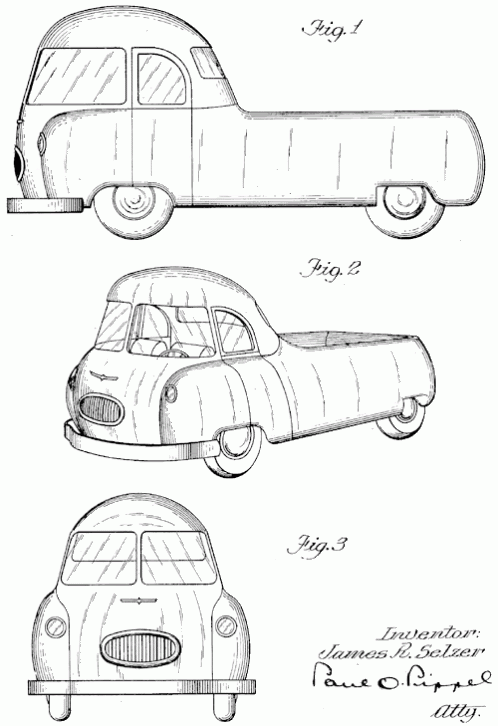
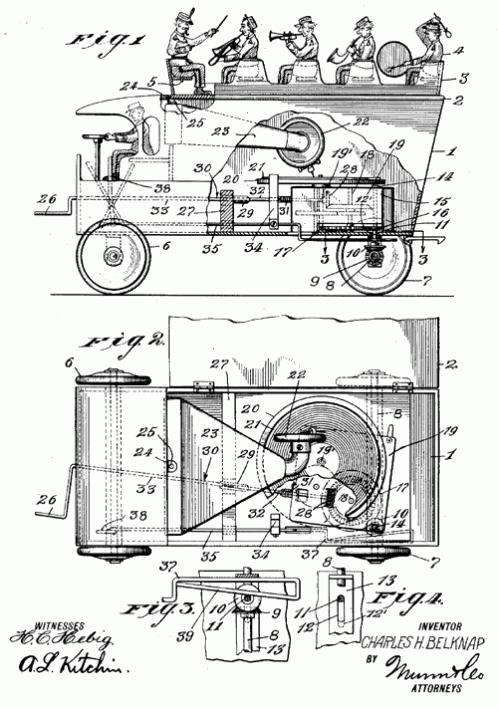
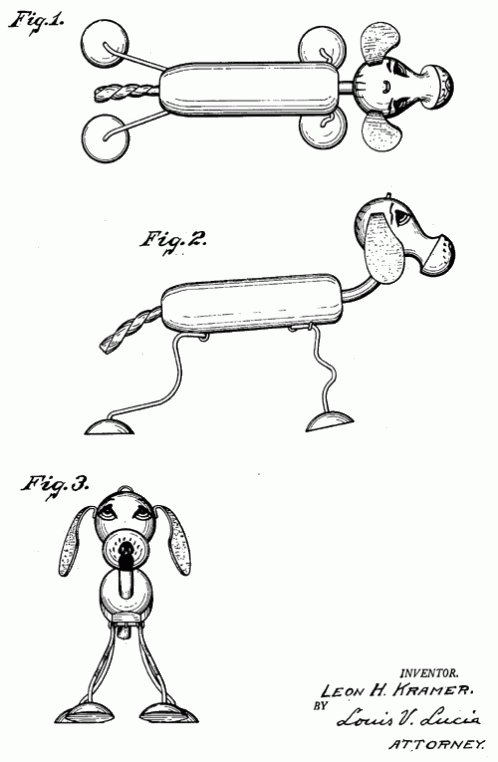
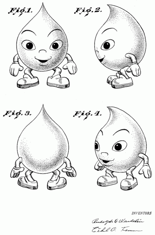
Fig. 1.


The Patent Room is one wing of the great Shorpy photoblog family (Shorpy is worthy of its own post). Filled with beautiful and interesting patent application drawings from the distant past and fairly recent. It's a massive collection, organized into Toys, Architecture, Airplanes, Cars, and Trains. The scans are clear and clean, available at large sizes, and they're lots of fun to browse. Random selection follows…


click on images to see them larger.


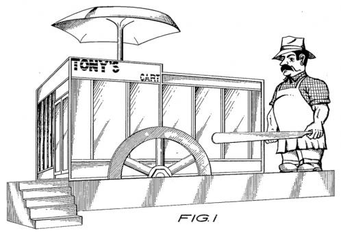
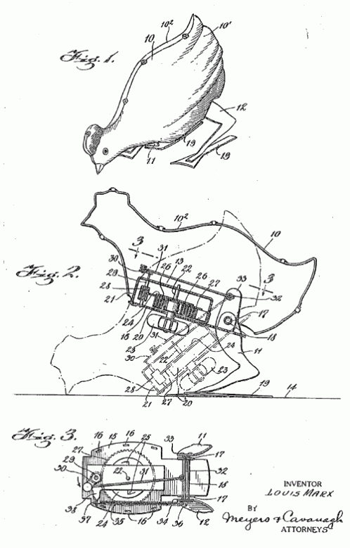
This one is great. There is a phonograph inside the toy truck! Looks like the back wheels spin the record under the tone arm… I wonder how well that worked?


...click here to read the rest of this post...

...click here to read the rest of this post...

Monday, December 17, 2007

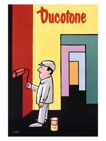
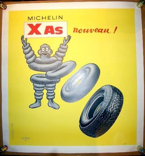
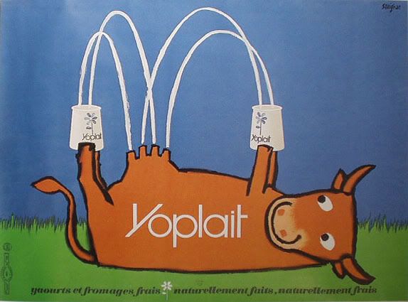
Ad-Art by Raymond Savignac.


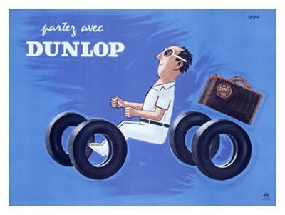
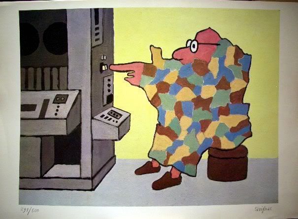
All that I know about Raymond Savignac I've only just read in this five year old Obituary from the New York Times. He's one of many great illustrators and designers who's work I've seen for years, but I never took the time to find out who's work it was. It's thanks to my favorite blog, Grain Edit, for posting an image of Savignac's work that I finally found out more about this highly celebrated poster artist and found more of his work online.

As usual I'm the last one to "discover" this artist only to find that all their posters command extremely high prices, even modern reproductions, and books about the artist are out of print and highly collectible too. Oh well. I'll settle for perusing the archives at the Savignac Store.

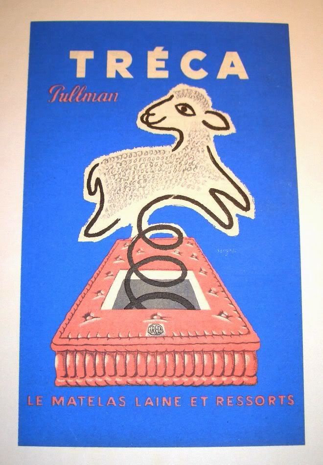
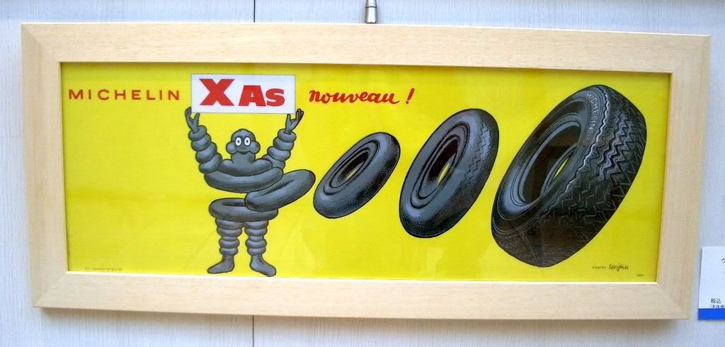
An assortment of Savignac posters follows, enjoy…

Note: Most of the images can be viewed larger if you click on them.


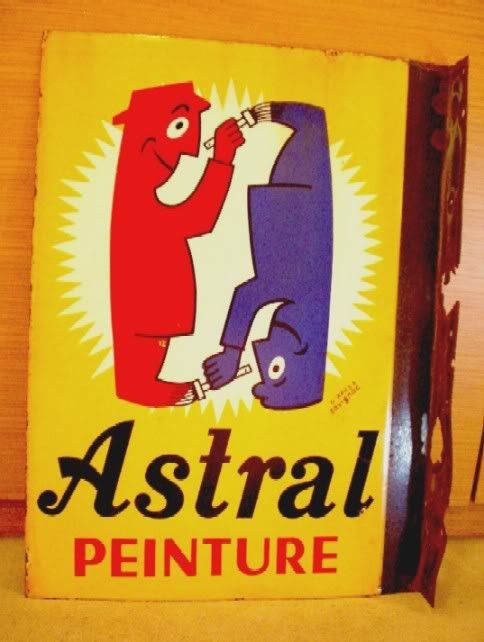
This image is funny, but sort of gross.

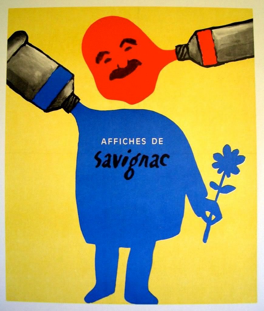
This must be a self portrait.


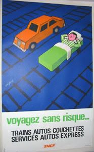
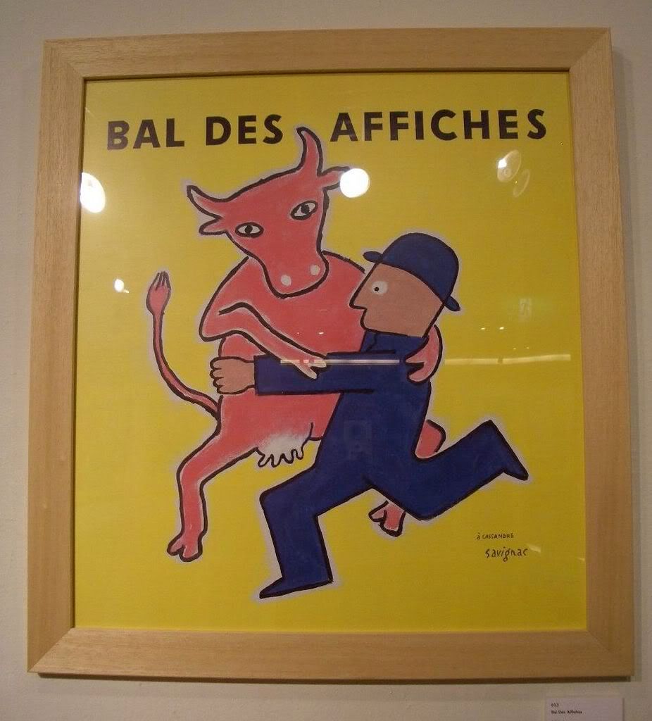
The man in this image looks a little uncomfortable with his dancing partners state of undress.
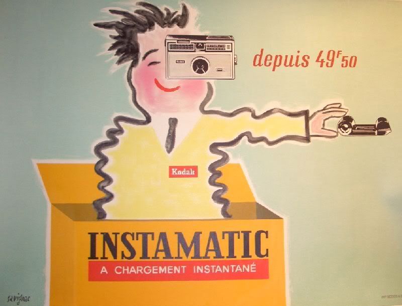
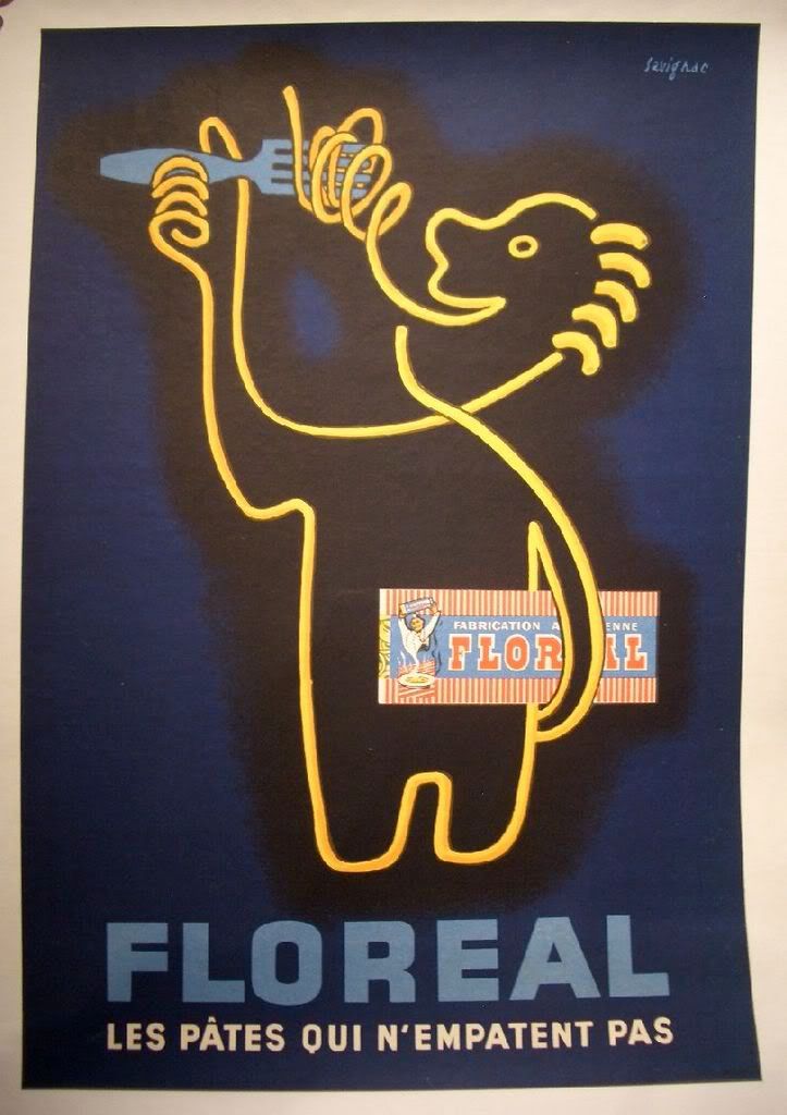

Spaghetti cannibal?

I love this painting. France doesn't really lend itself to anthropomorphism, but Savignac pulls it off.


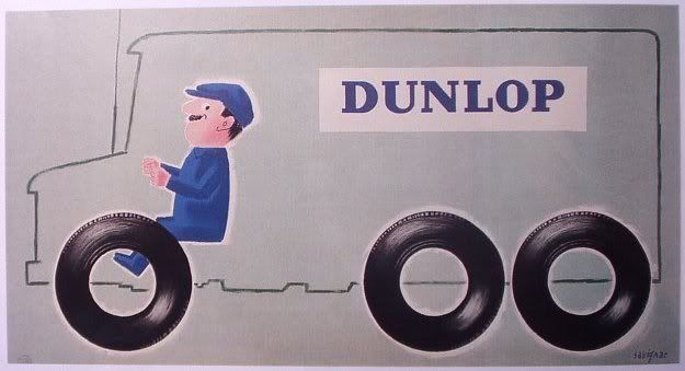
He worked in a few very different styles over the years, and sometimes, like in the above image, he brought the two together. The figure is so primitive and childlike, but the fridge and all the items inside are so expertly rendered.

...click here to read the rest of this post...

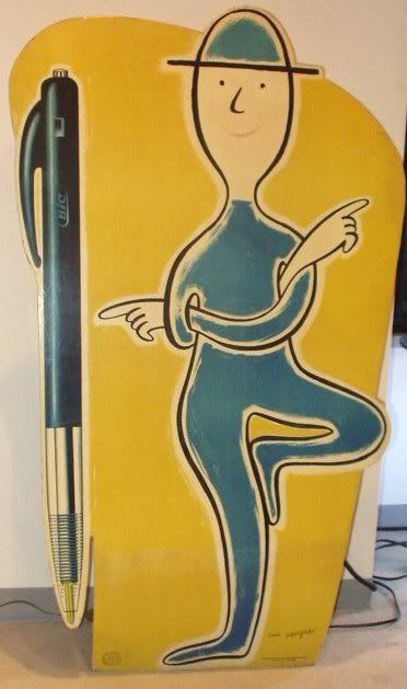
Friday, December 14, 2007

Ticket Stub

From 1996 until 2006, I sat in a small enclosed room each week and typed closed captioning and subtitles for thousands of television shows and home videos. As I worked, I would write down time codes where there were interesting images, and at the end of the day, since I often finished early, I would cue a frame and draw it in my sketchbook. Thus was born the zine Ticket Stub...


In 2006, the company downsized, and the entire editorial staff at our location was terminated during union contract negotiations; R.I.P. Ticket Stub.


...click here to read the rest of this post...

Why Gary Panter is The Greatest

My six-month-old baby girl got a wonderful surprise in the mail a few weeks ago.

...click here to read the rest of this post...


Hogan's Alley has posted a cartoonist Christmas card gallery here and here and here.

...click here to read the rest of this post...

Thursday, December 13, 2007

Stacks


Whenever I visit someone's place I always enjoy browsing their bookshelves. My friend Phil just sent me a link to an odd website he just threw together. It's a massive stack of just pictures, piled high of he and his wive's bookshelves. Every book in the house: Dec. 11th, 2007. Fun to scroll through. I wish everyone would do this.

Phil Elverum and Geneviève Castrée are both (but individually) wonderful musicians and artists (aka The Microphones, Mount Eerie, Woelv). If you are not familiar with their work and are curious you can look at their other websites P.W. Elverum and Sun and Woelv.

...click here to read the rest of this post...

The Revelation will be “Graphically Intensive”

One night a week, the Reverend Jack Van Impe appears on your TV to reveal that the news headlines read by his wife, Rexella, prove the imminent arrival of Christ Jesus. Citing endless bible verses from memory that forecast current events, he shows - with an air of irrefutable certainty - that the Anti-Christ will ascend from out of the European Union, Russia will attack Israel, and then in 2012 He will arrive . . . or something like that. Unlike the meth-fueled hypocrisy of Pastor Ted Haggard or the grinning condescension of Pat Robertson, the sincerity of Van Impe is beyond doubt.

His website has a gallery of paintings that imagine the Revelation, and they seem to come not from either a high art tradition of depicting key biblical scenes or a Hallmark "shimmering angels of light" style, but from van art of the '70s, as if William Blake airbrushed an old Econo-line . . . . (And those of you who have yet to get your comics this week should look at the current issue of Ghost Rider for art that looks a lot like these paintings. )

link to JVIM gallery

...click here to read the rest of this post...

Wednesday, December 12, 2007

Alvin, you should open up a window.


Back in September of 2005 I was commissioned to write a song for Alvin Buenaventura. I had placed an ad in one of my mini-comics advertising a custom song, for something like 7 or 8 dollars, and I had a few takers. (Tom K, I still owe you one! It's written but not recorded.)

I don't remember if Alvin requested a theme, or if I just choose to write about printmaking. It was fun to work on since it gave me an excuse to write about my own experiences in the print shop as a student at the Hartford Art School. I think all the references of that archaic world are universal, and so Alvin knew what I was talking about. Another satisfied customer I guess.

I always meant to go back in a re-dub the guitar which sounds really bland since I just plugged it direct into my computer, but I was happy with the keyboards in the end. It's funny, my piano skills are so poor that at certain points of the song you can literally hear me searching for the right notes, totally lost.

I recorded this on my computer using that program that comes built into Macs called Garage Band. I had never used it before so I got pretty carried away with the vocal pitch shifting and "Motown" drum samples. In the end the high pitched vocals have this really endearing digital lisp caused by the lo-fi point and click effects. Also, during long sustained notes the high vocal looses traction and wobbles like a front bicycle tire when you're going to slow. The deep vocal is just creepy, and the straight vocal track trails off with me trying to be Lou Reed without sounding like I'm trying to be Lou Reed. I think this was the last time I recorded any music.


The shop smells like orange peels, wax, and stacks of newsprint
Somebody should open up a window
Oak drawers filled with dusty lead melted into alphabet
Alvin you should open up a window

It takes thousands of pounds
it takes oil based ink
it takes a palette knife
it'll take an industrial sink

It takes years off your life
it'll take hours [spent] away from your wife
It takes flat files and spring loaded drying racks
it takes rags, sponges, and thumb-tacks

It takes exact-o knives
it takes friendly e-mail replies
it takes Paypal and artistic compromise… to print.

You can print.


...click here to read the rest of this post...

TUT


This page was drawn for Kristine McKenna's book Talk to Her. McKenna's interviews are unique in that rather than ask someone about their new album she seems more likely to ask, "What happens when we die?" or some general quandary no one really has the answer to. Since I was assigned Tom Verlaine, I figured a contemporary point of reference might be John Holmstrom's Punk Magazine, especially his hand-lettered interviews with Lou Reed and David Johansen punctuated by cartoon panels and fumetti.


...click here to read the rest of this post...

ALVIN!!!


When I was growing up, that uncommon name my parents assigned me invited endless, unwanted, hackneyed, tiresome taunts from children and adults alike. "Where's your brothers Simon and Theodore? he heh heh...." Yeah, charming, real clever. 9 out of 10 of people that I'd meet for the first time would immediately rattle that off, or even worse, sing the ditty. Annoying as that was it proved a reliable, instant douchebag detector. In any case what a crappy cartoon that was. Fucking falsetto warbling vermin, those chipmunks were the bane of my childhood. I hadn't thought of those guys much recently until the billboards started popping up everywhere, freakish! There's even one aroun d the corner, just a-block-and-a-half away from BP headquarters on the corner of Market and West Macarthur, above our beloved 'Easy Liquor' convenience store. Yesterday, on the way to the post office I decided to climb the beast. Yup there I am--if you look real close in the picture above, on the billboard, you can see the egomaniac jumping around (also note the woman with the pink coat entering the store, click on the photo for a larger view).

While up there I'm dancing around like a jackass posing for the camera and enjoying the view, man what a view! Down below a lady drives up, gets out of her car, and I see her exchange some words with Jordan and Beth (my conspirators.) She then calls up:

Woman in pink coat: "Hey Alvin"

Me: "Yeah?"

Woman in pink coat: "You just playin' right? ...I mean, if you gonna jump, wait 'til I'm gone."

She continued into the store.

When finished with her business, as she's exiting brown bag in hand, I'm awkwardly making my descent.

I hear her laughing and taunting.


Woman in pink coat: "Howda hell you get up there with all that junk in your trunk?! ...with that bubble butt? Ha!"

At least she didn't sing that damn song. Oh I love Oakland.


...click here to read the rest of this post...

Tuesday, December 11, 2007

VII: The Crypto Animadversion of Hercules

>
in the era 9 after the metalunarian pickle wars the dungeon planet smore was the flashpoint for the taser fire of the hemoglobins. the manifesto of the portacoup: emergence of the piltdown metastasis, immediate mass flatulence, skyscraper as taffy, high rise as node of cosmic potlatch, form follows fallow. we are "for" an omniquorum. tarps transient, pillbox prefabs, motorized balconies, flying buttresses, buttresses that shamble, cantilevered dont's, neon tires, plazas cobbled from teeth and calculus, the use of odors as a tectonic moor, doors which under no circumstances could even be knocked, holograms of hydrants, quadrants of atoms, blocks and blocks of furnace igloo chimneys, tenements of enemas. in bots you eye on a scope, gas stairs, water walls, cloud floors, a moratorium on state subsidized breathing, smashing the tyranny of what has been falsely termed by the powers that be as "breathing," general lung strike. like tendrils and cranes, jackhammer mileage of ducts and wet piping, safe housing of silos, locks and dams gushing, swarms spreading the caulking over the darting, standing like spigots, a drain in the floor. azimuth, dragoon of the nordic trak, whose eel chalice of lamentation portends eclipse, whose 15-sided die rolls the mighty obviator, toadstool of the bog, talisman of incarnate fracture.
>

the dark gods of cronkite plunged the omniverse into peril. the holoswine lore of a necromancer, an obsidian sit-in, star grid of the gravity stilts, malfunctioning secretly soldered by doctor saturnine, the coordinates locked for damp, sopping dwelling under the spell of the sob pastors, the wrecked rectors. fried egg in the sky divide, twinkles shed in the shellac bear down cataclysms of an eyeglass hillwise, clasps and tousled, domino bed in stream. the vortext orb ancients quaking nebulas and the theban ion chamber, taint lords bequeathed, solar metadroids, microthetan mitosis of moons, the hexahedron craft patrol blood rite, web limbed interlopers of serpents who utter doom quandaries, tectonic ruptures, idol temple of tempests, cactus maps, thrones of thrombosis. the scroll prophecy foretold, swift as clovers and cauldrons in a fortnight, a reap of coroner crutches and tomb teats. over the spent suns of the molten armada in atomic broccoli, seas of carrion tell of the odin omens that succor. stone abominations, reptiles scuffling for amethysts, scimitars drawn.
>
jets of flushes spiriting the daubs through pipes, a vast lattice of slashes and hurls and curses all handled away, some metropolis of waste inside your gut, as well, such partings, a softer network. the gurglings and exchanges, here a continent of the incontinent. stools and squats at the head, movements, dear diarrhea. all the drips. here were hallways that bled floors of raging flagellates, polyps gripping archways, porticos writhing worms, fistulas. all coiled upon itself, a maze in your belly, some rope pretzelled there, tubing bundled, goo shooting through, lengths tagged by a spray canner, the gamble of craps, the dread of squirts, the mock of logs, the down of dumps. a monorail folded, a milieu of filth pipelines with a rust sheen, girders cupping the spaghetti, tangled lassoes in your lap, the intestine horizon, muck under the stomach, reciprocity of the city and the tummy, riddle of the mobile grout, bowels below. the thronesman locale TPed, pubic fountains, gush periods, gazebos of excreta, fecal streets, urinal principalities, johns in pee pee teepees, thoroughfares of droppings, promenades of poop decks, laying of cables, scaffolds of crap, shit bricks and doo hickeys.
>

...click here to read the rest of this post...

Monday, December 10, 2007

Mr. Supercool

"Mr. Supercool, Brooklyn–1953." Photograph by Louis Stettner.

...click here to read the rest of this post...

Sunday, December 9, 2007

Pete Morisi

As a young fanboy, I preferred comic art that I thought of as energetic and “experimental.” Since I only read comics by Marvel and DC, I had a limited notion of what was possible; the artists who for me best represented the “cutting edge” were Bill Sienkiewicz and Steranko. The work by Pete Morisi that I saw in Charlton comics from the ‘70s was the exact opposite; it was cartoony in ways that seemed tired and old-fashioned, and it lacked the cinematic superhero dramatics of Steranko and the innovative page layouts and unpredictable drawing techniques of Sienkiewicz. Morisi (who often signed his work PAlll) has since become a favorite - for the same reasons that I once disliked him.

We often talk about the ways that cartoonists try to create a sense of life and motion in their work. But Morisi's art is compelling because it often communicates a sense of stillness, which is after all, a key feature of printed comics. (And to highlight this stillness, Morisi rarely uses motion lines.) It's a strange approach to take, given that he often worked in genres in which readers expected tension and drama.

It looks as if his characters are posing - almost frozen - and not “in the middle” of an action:


There’s a strange disconnect between the characters’ faces and what they are saying: the dialogue conveys the drama of the situation, yet the expressions often don’t - the main characters stare off somewhere beyond the panel, disengaged from the action and from each other. This lends an odd kind of pathos to the scene:


{Note the way that the grid shifts in the above 2-panel sequence, from window panes to an angled wallpaper design.}

Morisi is a careful designer and returns to number of elements throughout his Charlton comics:
The inset panel (and he often echoes the panel with square and rectangular objects that appear within it):


Stylized shadows/backgrounds:

The panel superimposed on a black panel:

Morisi's panels and pages are well composed - there's a real sense of balance and clarity - but not in a way that seems overly clever. Here's a page that brings together nearly all of the qualities discussed above:

[Almost all of the images above are from ‘70s Charlton horror titles.] [Pete Morisi at Wikipedia]

...click here to read the rest of this post...

Obsolete Repository: Trash Cans

When I was ten years old, I created the nationally syndicated comic strip Trash Cans. Readers immediately took to the heartwarming exploits of these metal mirthmakers. A nation mourned when days later I announced my retirement...


...click here to read the rest of this post...

Saturday, December 8, 2007

Adrian Tomine at Giant Robot, NY.

...click here to read the rest of this post...

The River of Failure

This is an editorial cartoon published in The Etude in October 1913, then reprinted as an ad for Chrysalis Records that most likely appeared in a record trade rag like Cashbox. The caption of the ad reads, "This allegorical drawing is adapted to musical education from an original drawing issued by The National Cash Register Company to point the road to business success." The framed clipping hangs next to the piano in my family's den.

...click here to read the rest of this post...

Friday, December 7, 2007

1000 Frames of Hitchcock.

Tippi Hedren, photographed by Robert Burks.

1000 Frames of Hitchcock, found on the Hitchcockwiki, is an intersting ongoing project that (I think) is created by someone named Dave Pattern, or DaveyP. He has distilled all (or most anyway) of Hitchcock's films into mute, columns of tiny screen-grabs. It's a funny idea since Hitchcock was such a meticulous planner and these 1000 frames are just a giant backward step in story telling. Bringing you back to what the completed storyboard must have resembled, minus the incredible cinematography (often Robert Burks) and art direction. Even if you aren't trying to read the silenced pictures, the 1000 frames project serves as a treasury of great photography, and inspired, and varied, graphic design.

Ingrid Bergman, photographed by Robert Burks.


Random out of context sampling…

Eustance Tilly (Lifeboat), photographed by Glen MacWilliams.


Frenzy, photographed by Gilbert Taylor & Leonard J. South.

The Ring, photographed by Jack E. Cox.

Shadow of a Doubt, photographed by Joseph A. Valentine.

To Catch A Theif, photographed by Robert Burks.


The Lodger, photographed by Gaetano di Venimiglia.

North By Northwest, photographed by Robert Burks.

Note: The boy-extra in the blue shirt, plugging his ears in anticipation of a gun shot after many takes of the same scene.

I love this shot. I'm surprised that it made it into the film actually. Relying on a tiny orange spot to make a point on the big screen in 1954 was pretty risky considering how many random spots and specs find their way onto any film with regular use. Oh, but it's such a great idea.Rear Window, photographed by Robert Burks.


...click here to read the rest of this post...

Thursday, December 6, 2007

Toda Mafalda

Mafalda is kind of like the Peanuts of Argentina. The children in the strip also discuss adult matters, but are more comfortable with light geopolitical and class struggle gags than Lucy Van Pelt and her neighbors. Ediciones de la Flor has published at least three books translated into English that are similar in production values to the landscape line of Garfield paperbacks, but have not caught on here, if they were supposed to. It'd be cool to see a translation of the 658 page Toda Mafalda.


video


...click here to read the rest of this post...

Wednesday, December 5, 2007

Tippy's Friend Go-Go #15


This is a scan of original art by Doug Crane I purchased this year, despite an office temp's wages, at the San Diego Comic Convention. The subject matter is perennial--a discotheque tableau vivant. Beneath Animal's overly verbose set-up line, you can see a tentative arm raised in pencil and thought better of. The potted plant I consider a composition cop out, but I can appreciate the white out of all the music notes. Other tell-tale signs: the guitar looks like it's backwards, and the drummer has neither throne nor cymbals. Next I need to find an actual copy of the comic book.

...click here to read the rest of this post...

...click here to read the rest of this post...

Monday, December 3, 2007

Closed Captioning


...click here to read the rest of this post...

"I don't count the feathers, I just count the wings."

King Birds, avaliable as a serigraph from Treadway Gallery.

If you or the grade school you went to owned a copy of The Giant Golden Book of Biology, than you may recognize the work of Charley Harper.


I really like his work, sort of a John J. Audubon for the modernist set and children. Harper's geometric distillation of animals, items, and environments and his subdued palette have a lot in common with, and maybe even directly influenced, the work of both Richard McGuire and Chris Ware. Sure, many people have used this manner of simplification to represent all sorts of things, but in the work of Harper, McGuire, and Ware I think the drawings take on more than just an iconic or typographic appearance, but they usually capture a movement or gesture of whatever sort of person or animal it is they've drawn which really helps bring the drawings to life.

Backyard Birds; House Wren, With Clothes Line; Blackburian Warbler; Beetle Battle, all available as prints from Fabulous Frames & Art. Giant Golden Book of Biology available in dusty thrift store bins($1), your local library's annual discard sale(25¢), and ebay($400).

Todd Oldham recently assembled a massive book of Harper's work and produced this short video about Harper where you can see Charley talk about his work, and a take a peek into his studio.

Harper died earlier this year at the age of 84.

"When I look at a wildlife or nature subject, I don’t see the feathers in the wings, I just count the wings. I see exciting shapes, color combinations, patterns, textures, fascinating behavior and endless possibilities for making interesting pictures. I regard the picture as an ecosystem in which all the elements are interrelated, interdependent, perfectly balanced, without trimming or unutilized parts; and herein lies the lure of painting; in a world of chaos, the picture is one small rectangle in which the artist can create an ordered universe."


...click here to read the rest of this post...

Seldom-Seen Abner Dean

Two ads from the late 1930s:

...click here to read the rest of this post...

Sunday, December 2, 2007

Mister Wonderful

Daniel Clowes’s weekly strip “Mister Wonderful” has been appearing in the New York Times Sunday Magazine since 9/16. Throughout the strip, Clowes uses all sorts of interesting formal techniques to explore and represent the psychology of the main character, Marshall, who like other Clowes protagonists, has a complex inner life that is often at odds with external realities. In a sequence from last week’s episode (#11), Marshall and Natalie are having – or seem to be having – a conversation.


To show Marshall’s self-involvement, Clowes superimposes Marshall’s narration boxes (perhaps a better term would be "interior monologue boxes") onto Natalie’s word balloons. At first, her words are completely inaccessible to us because we are "hearing" through Marshall; but as he begins to pay more attention to her – and less to himself – her words become more visible-audible with each passing panel. It’s a interesting way to show how we can simultaneously be aware of different things – our thoughts and another’s speech – and how our awareness can change. (It seems that Marshall becomes conscious of her words when they are relevant to him; she is saying that their date is coming to an end, a prospect he fears). There’s a deep irony in the first panel: Marshall thinks they are "perfect for each other," yet the placement of the narration box – which implies that he’s not listening to her – might suggest otherwise.

...click here to read the rest of this post...


Mucid Cuspidor (aka Matt Brinkman) rocks Heco's Palace in Oakland, CA with a CDJ and a hodgepodge of other electronic gizmos, along with Tusco Terror, DJ Dog Dick, Sisprum Vish and others.

...click here to read the rest of this post...

Abner Dean

About eight years ago I came across Abner Dean’s Naked People (published in 1963) in a used bookstore. I had never seen Dean’s work before, and I certainly had never seen cartoons that looked like this:


During the last few years I have been assembling a bibliography of Dean’s work and collecting as much information as I could about his life. There wasn’t much biographical material available, only a few single-paragraph entries in encyclopedias of cartoonists. But after doing interviews with relatives, searching through various library and newspaper archives, reading Dean’s notebooks and papers, tracking down his correspondence, and buying a lot of his work, I felt I had enough information to write an essay on his career. The current issue (#9) of Comic Art includes the essay, a visual biography with around 45 color images. Even before I planned to write on the cartoonist, I had been reading what little there is about him, mostly short reviews and features in magazines from the 40s-60s, and things like this Wikipedia entry. The entry characterizes Dean’s work as “reflecting the themes of disillusionment, self-delusion, yearning and the meaninglessness of modern life,” claims repeatedly made for Dean’s cartoons; while partially true, they seem to me to misrepresent Dean’s philosophy. I titled the essay “Sometimes we’re lovable in our error” (a quotation from Dean’s notebook) in part because I see many of the cartoons as more optimistic and sympathetic towards their subjects than had other readers -- and the notebooks, in which Dean talks about specific cartoons, seem to support this interpretation.

Here’s a Dean cartoon titled “It’s good to own a piece of land” (from What Am I Doing Here? 1947).


“Don’t search for hidden meanings in this drawing,” Dean cautioned. “They’re all apparent here – nothing hidden.” Like many of Dean’s titles, this one is to be taken literally: it’s good to own land. Yet Dean criticized the smugness of people who fail to extend sympathy to those in need: “What about those other people – do they own any land?” Dean’s cartoons may focus on a central protagonist, but he always wants us to think about the conditions under which others live. Dean also worried that readers might bring their own philosophical biases to this cartoon, warning that “There is no implication here that the state should own the land.” Such a polemical interpretation might take us away from the real-life implications of the cartoon and the ways that people suffer. Dean is not criticizing the main character for the joy he takes in ownership, but for his ignorance of those around him (his eyes are closed). While many of Dean’s cartoons are cryptic, others (like this one) communicate a premise in a clear way, and Dean’s comments are a helpful reminder about over-reading and misinterpretation. If readers assume (as many have) that Dean is not sympathetic towards many of the characters he creates, then they might be bringing their own cynicism, and not Dean’s, to the drawing.

Here’s another Dean cartoon, “I made this.”


“Our hero is part fool-part wise man,” Dean said, “but for one moment he partakes of greatness -- ridiculous as his creation may be it is better than the plodding absence of consciousness. Within its hectic form is a plan -- is self recognition -- in its fumblings is the hope --.” It might be easy to see this cartoon as ironic, mocking the foolishness of the immature artist. But Dean frequently displayed his sympathy for those who have a “plan” and attempt to create works of art or ways of thinking that will, if only in some small way, make conditions better for themselves and others.

[The Wikipedia entry refers to an essay on Dean by Chris Lanier that’s well worth reading.]

...click here to read the rest of this post...

Saturday, December 1, 2007

Suiho Tagawa Slide Show

After providing lettering for a translated Norakuro story by Suiho Tagawa that appeared in Kramers Ergot 6, Sammy Harkham and Alvin asked me to put together a lecture to deliver at the Hammer Museum on the occasion of the book's release. Despite feeling that I wasn't really the person for the job, I accepted, figuring if I didn't do it likely no one else would. This lengthy post contains the slides as well as a few notes that I referred to during my speech. It should be noted that it contains some potentially disturbing images.

video


Thanks to Milton Knight for providing the animation clips and fellow Mome contributor Tom K. for providing contemporary photographs of the Norakuro Museum. Please bear in mind that I'm not a scholar, nor do I speak Japanese; I’m just the letterer! Bear with me. I first heard of Suiho Tagawa from Daniel Clowes, who had a multivolume set of his work that I saw during a visit. I also read Chris Ware list him as an influence in Comic Art magazine.


Who was Suiho Tagawa? Born 1889, died 1989. In his 40s, he created the series Norakuro about an orphan dog in the military service for Shonen Kurabu magazine. The series followed the dog through a series of military promotions. He begins as a private and rises in rank. Not much information is available in English. Described on the internet as an “anarchist.”

Since I don’t have biographical data, I want to say a little bit about the time period in Japan based on some rudimentary research and simply look at some slides of his work, since they are difficult to come across in this country.

But first let’s watch a two minute Norakuro cartoon. I should mention that these clips have a new dubbed soundtrack. I am not sure whether the original soundtrack, if there is one, still exists.

video

The time period during which Tagawa’s work appeared, 1931-1941, is the precursor to WWII and is sometimes referred to as "The Dark Valley." Japan was an imperialistic military state. There was widespread poverty, volatile coups attempted by military factions where cabinet members were killed, and ill-advised military aggressiveness. This quote I think explains it best: “In Japan, fascism was imposed from above by the military and the bureaucrats, aided by civilian rightists. It is not comparable to the mass parties of Germany and Italy, was not very effective in organizing or mobilizing the populace, and was not led by a charismatic leader.” This period is bookended by two events: in 1931, the Mukden Incident, and in 1941, the invasion of Pearl Harbor.

This slide serves as a geographic refresher course. The feeling of the time was one of “manifest destiny,” Japan standing in front guarding Asia. Note Mukden and Manchukuo on map. There's a line of dialogue in the Norakuro story in Kramers that states, “A new Asia can be created." Army Minister Sugiyama said, “We’ll send large forces, smash them in a hurry, and get the whole thing over with quickly.” The inability to conquer the vast China led to the conflict of WWII and eventual defeat.

Here we see the same map on a page from Norakuro.

I wouldn’t be surprised to learn these are maps of specific battle areas in China. Is that the Yangtze River?


This comic page from the Tintin book The Blue Lotus by Herge is an illustration of the Mukden Incident of 1931. Officers in the Japanese army in Manchuria blew up a railway section and blamed it on the Chinese as a pretext for invasion. Herge also dramatized Japan leaving the League of Nations in 1933. Another lecture could compare the two cartoonists. Both have things in common--children’s comics, the clear line, and war compromise.

During this period, the public was told to believe four things: 1. The emperor was the natural ruler of the world. (Does the man on the horse look like that to you?) 2. The Japanese were racially superior to the rest of the world. 3. It was the destiny of Japan to control Asia. 4. What was called the “Greater East Asian War” was a holy war.

During this conflict there were also terrible atrocities such as the Rape of Nanking in 1937. 300,000 non-combantants were killed, and there was widespread brutality, looting, and arson. The caption reads, "The Japanese media avidly covered the army’s killing contests near Nanking. In one of the most notorious, two Japanese sublieutenants went on separate beheading sprees near Nanking to see who could kill one hundred men first. The Japan Advertiser ran their picture under the bold headline: 'Contest to Kill First 100 Chinese with Sword Extended When Both Fighters Exceed Mark—Mukai Scores 106 and Noda 105.'" This page is from a book about the Rape of Nanking; I’d say avoid the pictures section if you can.

Remember to read right to left. One of the biggest objections to Norakuro is the depiction of the Chinese as pigs. The translator told me that the pigs’ dialogue is meant to be a stereotyped version of Chinese dialect. Japanese racism was apparently widespread. One book I read had a Japanese general telling a correspondent, “To be frank, your view of the Chinese is totally different from mine. You regard the Chinese as human beings while I regard the Chinese as pigs.” Not having read the translations of all of Tagawa’s comics, it’s hard to confront this topic. Note beheading.

From Ethan Persoff’s website of instructional and propaganda comics, an excerpt from "How to Spot a Jap." Drawn by Milton Caniff, an artist featured in the Hammer’s Masters of American Comics exhibit.

Typical WW II depiction of the Japanese in American comic books. Offensive, borderline camp. Giant Robot published a gallery of these covers in one of their issues. This cover shows when kinetic action shades into ideology.


video

Art Spiegelman’s Pulitzer Prize winning Maus also uses an animal metaphor. Cats are Nazis, Mice are Jews, Pigs are Poles.

Wally Wood from Two Fisted Tales. Although Harvey Kurtzman's war comics were complex, this is more what people expect to see in a war comic. Sgt. Rock, Sgt. Fury, types, kinetic action.

Contemporary war comic by Shigeru Mizuki. Sent to Papua, New Guinea. Got malaria, watched his friends die, and in Allied air raid lost his arm. Taught himself to draw with his right hand. Worth his own lecture. Famous for children’s comic “Ge Ge Ge no Kitaro.”

Photograph of original art. Note wash and pasted in lettering.
Books follow from private higher. Early stories appear similar to the barracks humor of Sad Sack or Beetle Bailey.

From a Beetle Bailey comic.

War comics cloud into propaganda. Right-minded, boring. The last panel balloon on this page reads, "Please note that all human beings have exactly 27 bones in each hand! They are arranged the same no matter whether the man lives in Africa or America."

From The People’s Comic Book, Chinese propaganda comics published in the U.S. in the 70s. Very stiff.

Cartoonists in Japan may have been influenced by films as much as comics. Poster of Harold Lloyd, silent film comedian.

Photo of Tagawa. Note Harold Lloyd glasses.

This is, of course, Bambi, by, as we all know, Osamu Tezuka.

There is also a version he did of Pinocchio, but it seems unlikely either will be translated here.

But more than Disney, the obvious influence will be determined after this short video clip that dramatizes the pages above.

video

Yes, Felix the Cat, known for his brooding walk.


I used Felix the Cat's lettering as a guide when I lettered the translation.

I also tried to use similar punctuation. Well, there is almost no punctuation, usually one or two exclamation points.

Tagawa is more streamlined. Now let's look at a five minute clip from General Norakuro (1934), again dramatizing the pages above.

video


Now the comics. This is a slipcase for one of the collected volumes.

Page layouts are static, mostly 3 panels to a page, often usage of full page and double page. Symmetrical.


The top left circle is flip-book animation.


For war comics, Tagawa shows a special interest in depicting nature.


Note split panel action.


Beautiful Art Deco explosions.

Original art from Norakuro Museum, not sure of size. Note racist depiction of natives. Washes act as color guides?

Printed version of same spread.


Tagawa also used double page spreads for long horizontal panels.


Striking use of silhouettes.


Now let's close the books and look at photographs of the Norakuro Museum in Japan.

video

This is the street where the Norakuro Museum is located in Tokyo, Japan. (These are all photos from fellow Mome-ster Tom K. Thanks, Tom!)

Tom said he was told that Norakuro was for "grandmothers." Kids were more interested in Gundam Wing.

Set of volumes scans are from in upper left. In the middle is most likely an issue of the manga in which the work was originally serialized.

Postcards showing pastel work.

Similar to the Charles Schulz Museum which also has drawing area preserved.


Continuity of merchandise.


From animated series, 1980s.

Drawings by children. Closing remarks. My own feeling is we are currently living in a time of war, where our government seems to have imperial and business aims detached from the will of the common people. I think that makes this work resonate in the imagination.

video


...click here to read the rest of this post...

Obsolete Repository: Public Access

video
video
video

For best results, please play all three at the same time.

...click here to read the rest of this post...