 A panel from a story in Starstream 3 (1976): "I saw lots of emergencies, but none with the blue-circled eyes . . ."
Saturday, December 29, 2007
Moon Bloat Carrier
Posted by
Ken Parille
at
10:27 AM
23
comments
![]()
Thursday, December 27, 2007
This Again
One of the most tired and unimaginative criticisms of ‘alt comics’ is the following: desperate for validation by the literary elite, cartoonists create boring stories about the uninteresting problems of average people so that The New Yorker and their ilk will reassure them that they are worthy. This argument presumes an intimate knowledge of the cartoonists’ psyches that the critic never has; and those who make this argument are rarely good readers of the comic that’s right in front of them, so how can we put much faith in their analysis of a human being? Most artists would like to be appreciated by smart readers, but to reduce the many motivations that drive them to a single, overwhelming need to be loved by the ‘tastemakers’ shows a real lack of depth or suggests that The Critic is posing (“He’s too smart to really believe that, right?”). Why is he upset that others create comics that he doesn’t like? I assume that artists are trying to make a comic that they believe is good, interesting, funny, moving, or truthful, etc, even when I think it stinks.
Then The Critic will direct his attention to the reader, psychoanalyzing him by making (surprise!) the same argument. This reader, the critic says, thinks that “if the elitists like the comics I like, then I can feel good about myself and the comics I read; respectability, long sought, will finally be mine.” (I have never met anyone like this . . .) So, if you make or like a comic the critic doesn’t like, it must be because you are deeply insecure: he can see no other reason and can’t imagine that other people think differently than he does or like different kinds of stories. Why, though, does this critic constantly return to the issue of validation?
Comics in general have not achieved the status of, say, the novel, but the debate about acceptance is really on its way to being over, a fact that makes these complaints a waste of time, and a bit foolish. Comics by ‘alt-cartoonists’ in particular are being reviewed and printed in mainstream periodicals; their books are being published by major publishing houses, being made into films, and being read in more and more high school and college courses . . .
A cartoonist whose work I sometimes like and whose political essays I usually agree with makes some of these complaints here. Not only does Rall rehash these arguments and offer confident claims about cartoonists’ and readers’ sex lives, but he shows himself to be a shaky reader by the unfounded assumptions and misrepresentations he makes; for example, he calls woman in Ware’s strip a “spinster,” an often derogatory term almost never applied to anyone as young as this main character. Here’s another one: “Daniel Clowes' "Mister Wonderful" treads standard art-comics territory: unattractive boy meets dowdy girl.” It matters a great deal that these main characters are not a boy and girl, but two middle-aged adults with decades of relationship trouble behind them, a history that two teenagers simply could never have. Clearly Rall is trying to be cute here, but he intentionally misrepresents the age of the characters in Clowes’s and Ware’s comics to make them appear to be something they aren’t. If after reading a review/essay, you come away with a completely mistaken impression of what the comic is about, you know the writer is not to be trusted . . . . Is he afraid that if he describes them accurately, they might actually sound appealing?
“I don't know why anyone cares about what other people read,” Rall asks. It’s a good question, one he should ask of himself . . .
Posted by
Ken Parille
at
2:06 PM
16
comments
![]()
Sunday, December 23, 2007
Frank O'Hara

I am actually not very familiar with O'Hara's poetry, but I remembered this one from college, thus the orange.
Four Great Stories of 2007

The following is not a best-of list or a series of reviews, but short discussions of why these books are some of my favorites from 2007, and would be favorites in any year in which they appeared. I focus a few things that I find particularly interesting in each story as a way of trying to explain something that I find appealing about the cartoonist’s approach in general.


The kinds of things I talked about in Hernandez and Clowes are often absent from his work. Tomine prefers mid shots and medium close ups and only occasionally uses slightly high angles -- this creates a rhythm different than Hernandez’s and yet one that’s equally engaging. Unlike Mister Wonderful, every page in Shortcomings uses either 6, 7, 8, or 9 square or rectangular panels arranged in a traditional grid and has a consistent margin size and gutter size; there are no thought balloons or narration boxes; sound effects are limited to roughly two different types of hand-lettered ‘fonts’ with some, but not much, variation in lettering size (page 43 is an exception); and there are no motion or emotion lines or any similar kinds of effects . . .
He uses the whisper version of the word balloons, in which the balloon is made up of dashes, and the telephone conversation word balloon, in which the tail of the unseen speaker’s balloon takes the zig-zag shape often used to represent electricity: The storytelling in Tomine is literally straightforward -- the narrative is completely linear and each panel depicts external, objective reality (whereas in Mister Wonderful, for example, Clowes includes flashbacks or panels that features images from a character’s fantasy). Yet the seeming transparency that arises from Tomine’s formal choices is balanced by the story's complex look at issues of ethnicity, sexuality, and identity. And Shortcomings is never burdened by the moralizing that sometimes harms narratives that tackle these kinds of issues.
More so than many cartoonists, Ware repeatedly focuses on objects, showing how the most mundane item can be invested with emotional weight (perhaps in Ware objects perform the role of geography in Hernandez . . . ). The main character engages in reveries about other people’s lives inspired by seemingly random objects, such as a camera, or in this case, a hook:
Friday, December 21, 2007
Kdo Chce Zabit Jessii?
In "Who Wants to Kill Jessie," a superhero, a cowboy, and a bombshell all spring to life from a cartoon serial in "Technical Review" magazine. It's one of my favorite comic book movies.
Tuesday, December 18, 2007
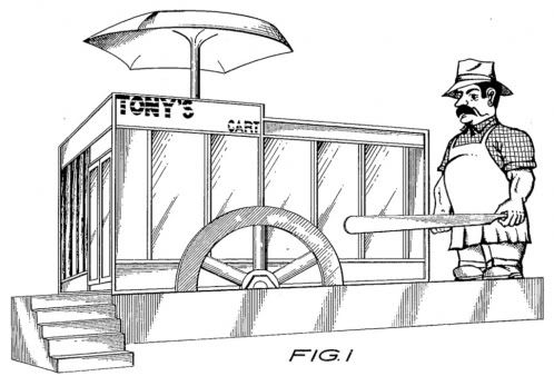
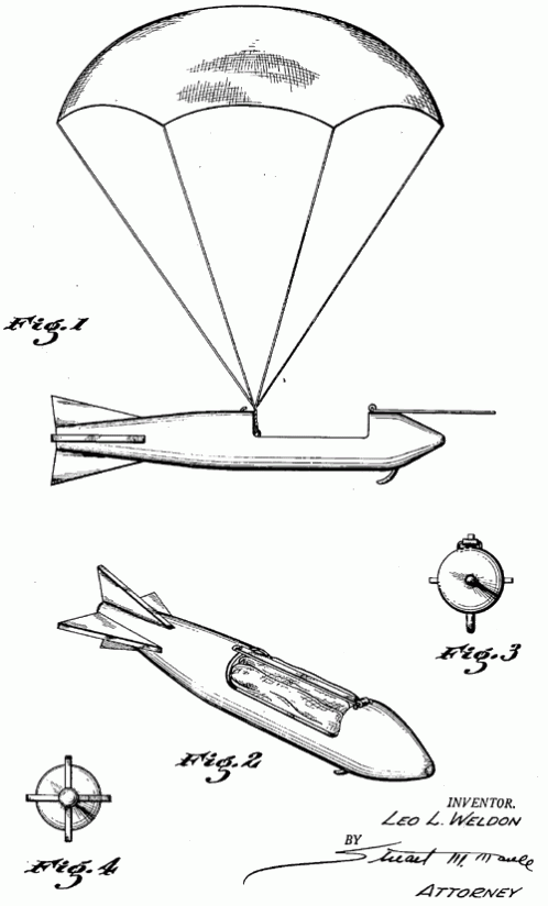
Fig. 1.

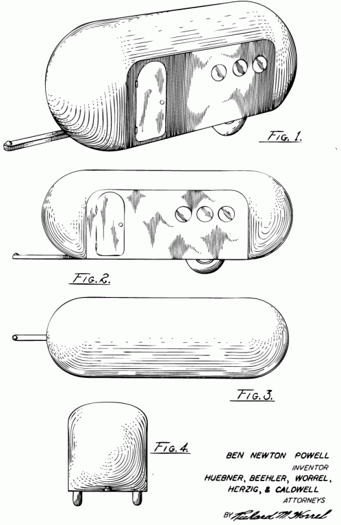
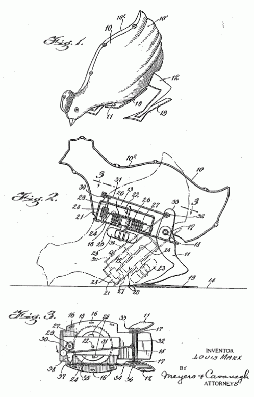
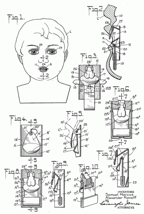
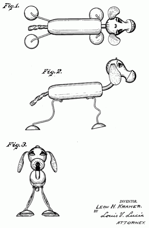
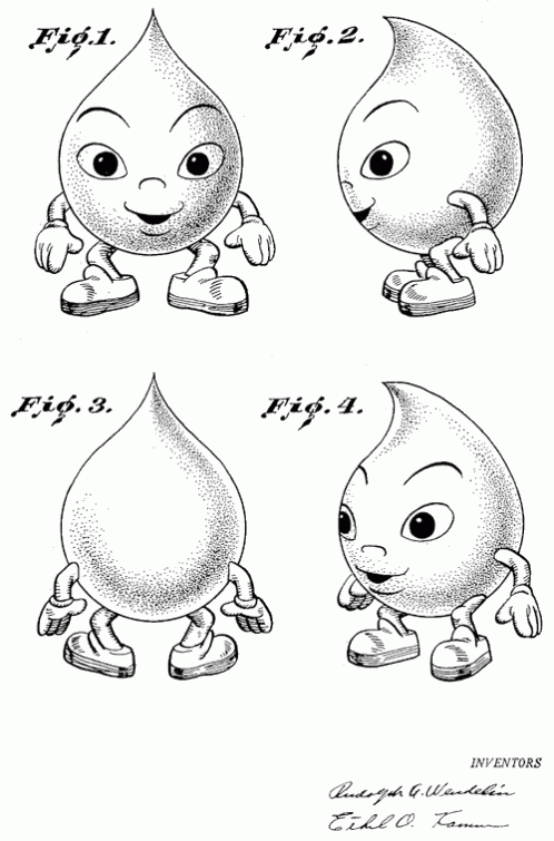
The Patent Room is one wing of the great Shorpy photoblog family (Shorpy is worthy of its own post). Filled with beautiful and interesting patent application drawings from the distant past and fairly recent. It's a massive collection, organized into Toys, Architecture, Airplanes, Cars, and Trains. The scans are clear and clean, available at large sizes, and they're lots of fun to browse. Random selection follows…
click on images to see them larger.
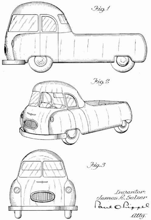
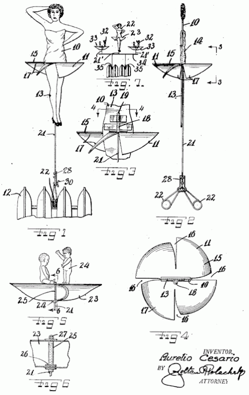
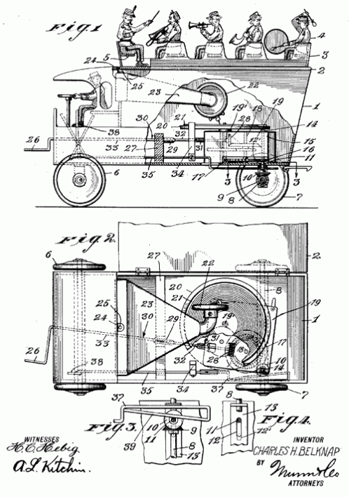 This one is great. There is a phonograph inside the toy truck! Looks like the back wheels spin the record under the tone arm… I wonder how well that worked?
Posted by
J. Bennett
at
1:06 PM
11
comments
![]()
Monday, December 17, 2007
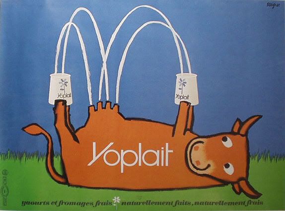
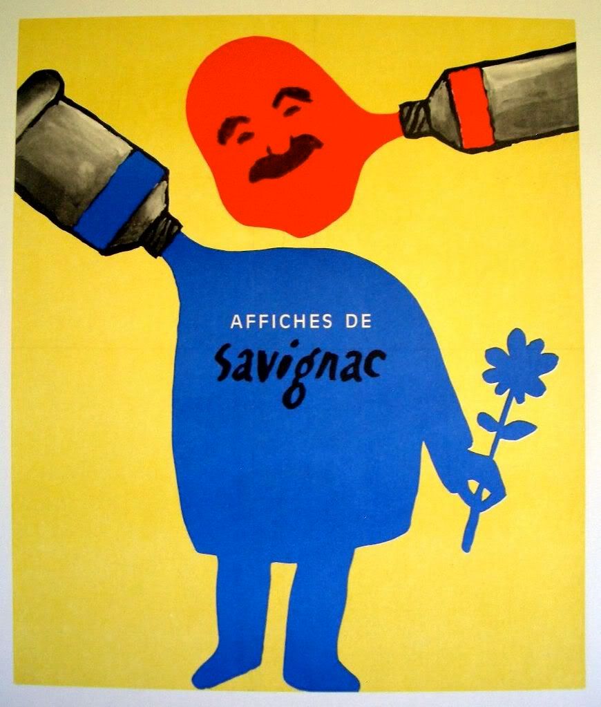
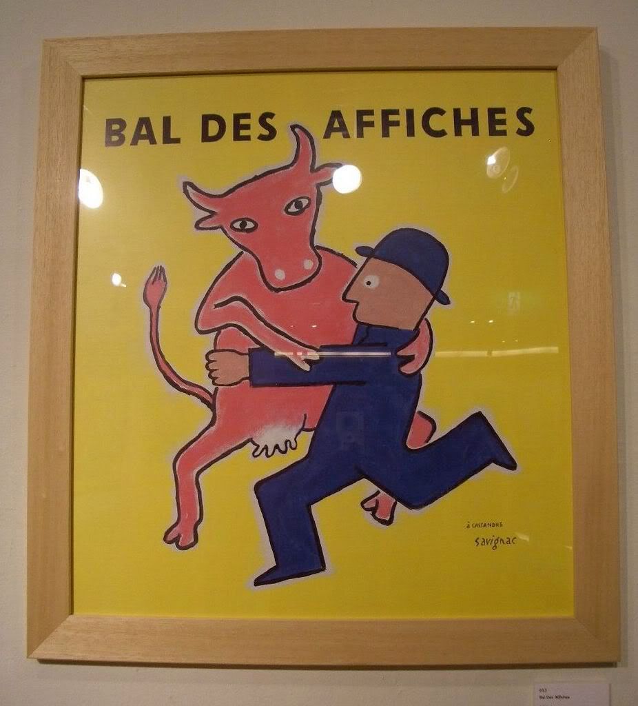
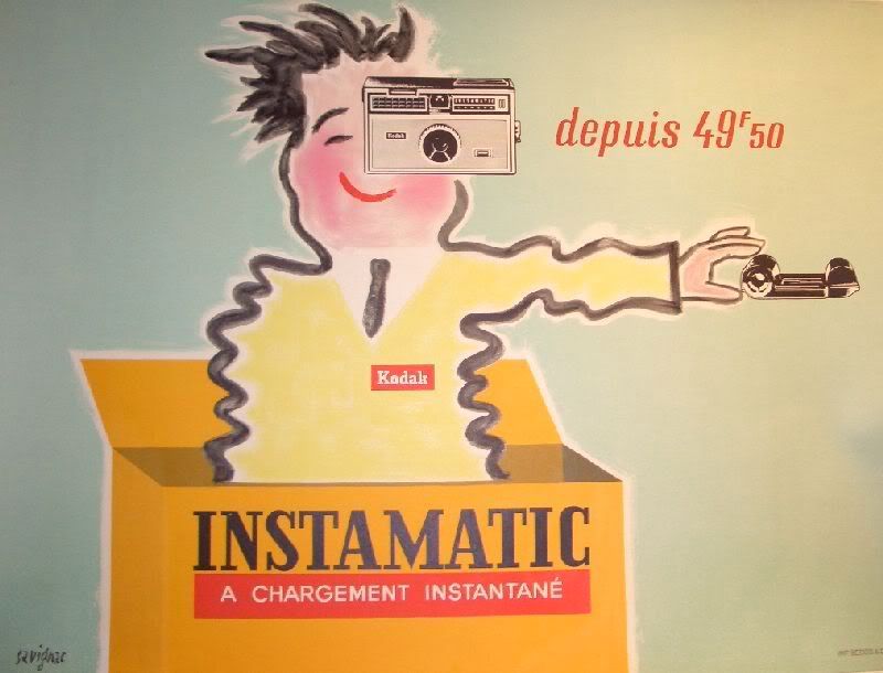
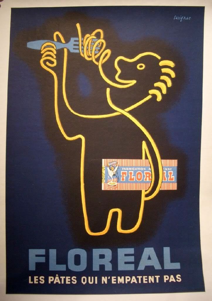
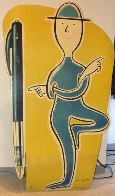
Ad-Art by Raymond Savignac.
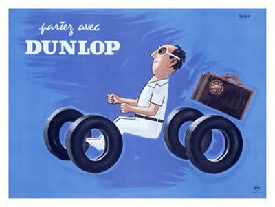
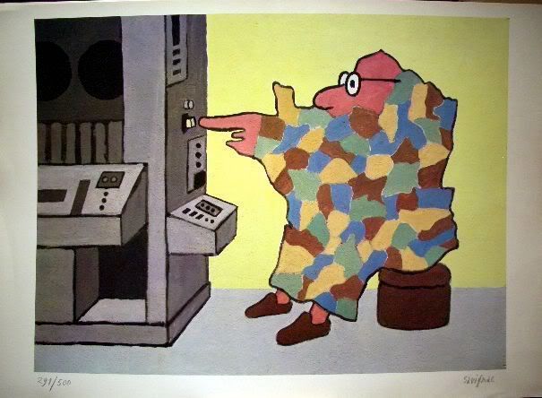
All that I know about Raymond Savignac I've only just read in this five year old Obituary from the New York Times. He's one of many great illustrators and designers who's work I've seen for years, but I never took the time to find out who's work it was. It's thanks to my favorite blog, Grain Edit
As usual I'm the last one to "discover" this artist only to find that all their posters command extremely high prices, even modern reproductions, and books about the artist are out of print and highly collectible too. Oh well. I'll settle for perusing the archives at the Savignac Store.
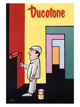
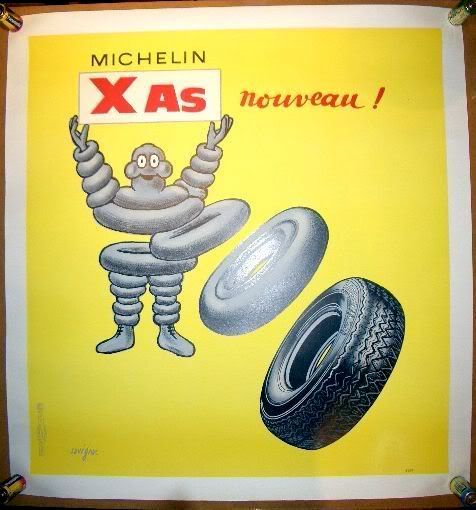
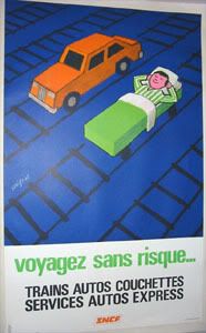
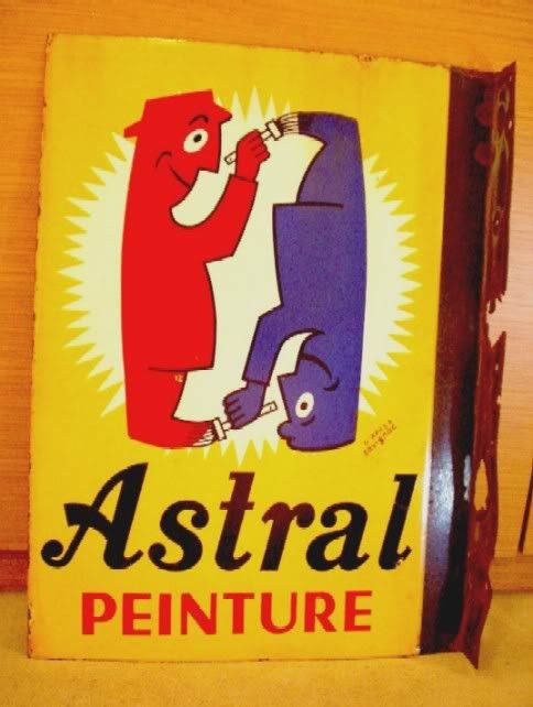
 I love this painting. France doesn't really lend itself to anthropomorphism, but Savignac pulls it off.
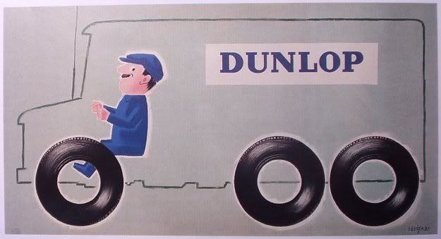

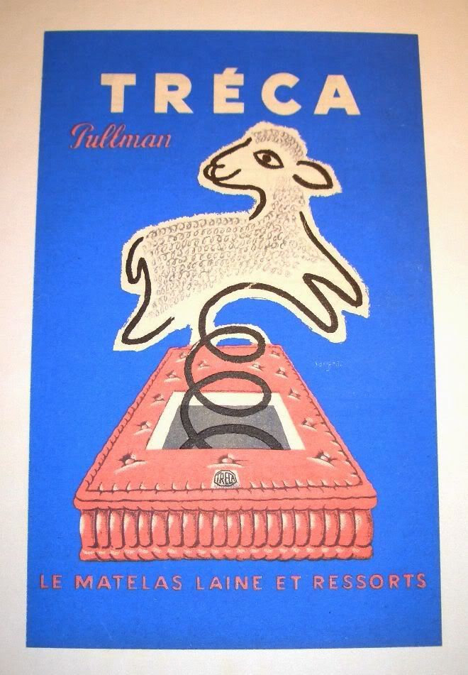
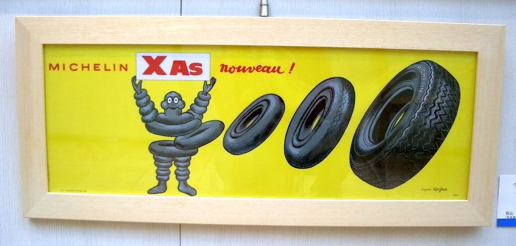
 He worked in a few very different styles over the years, and sometimes, like in the above image, he brought the two together. The figure is so primitive and childlike, but the fridge and all the items inside are so expertly rendered.
Posted by
J. Bennett
at
1:06 PM
20
comments
![]()
Labels: advertising, Design, illustration, posters, Savignac
Friday, December 14, 2007
Ticket Stub
From 1996 until 2006, I sat in a small enclosed room each week and typed closed captioning and subtitles for thousands of television shows and home videos. As I worked, I would write down time codes where there were interesting images, and at the end of the day, since I often finished early, I would cue a frame and draw it in my sketchbook. Thus was born the zine Ticket Stub...
In 2006, the company downsized, and the entire editorial staff at our location was terminated during union contract negotiations; R.I.P. Ticket Stub.
Why Gary Panter is The Greatest
Posted by
Todd Hignite
at
2:43 PM
6
comments
![]()


