
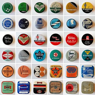
 In 1992 Pentech began producing a series called "Cool Art Pencils" that features art by well-known cartoonists, such as Peter Bagge and Gary Panter. I can't find much information on these, but I have 7 different ones, numbers 1, 2, 5, 7, 8, 14, and 18 -- so I assume the series had at least 18 different pencil sets. All of them have color art on the package and pencils, and black and white art on the back. Here are some images:
Gary Panter (#7):
 Drew Friedman (#14):
 Lou Brooks (#1, 8, 5):
 Elwood H. Smith (#2):
 Peter Bagge (#18):


If you have any other information, please post it in the comments section.
Tuesday, January 29, 2008
"Cool Art Pencils"
![]()
Monday, January 28, 2008

Wednesday, January 23, 2008
Side by Side: Ware, Brunetti, Henry, Boop
 I never would've known about the relationship betweeen these three images if not for Chris Ware's amazing Acme Novelty Date-book, Vol. 2, the source of the above image.

Richard McGuire / New Yorker
 A winter cleaning uncovered a stash of illustrations clipped from past New Yorkers. Here's a few from the great Richard McGuire that appeared in 2001-2002.


 The previous issue of Comic Art (#8) includes a McGuire cover and feature.


Monday, January 21, 2008
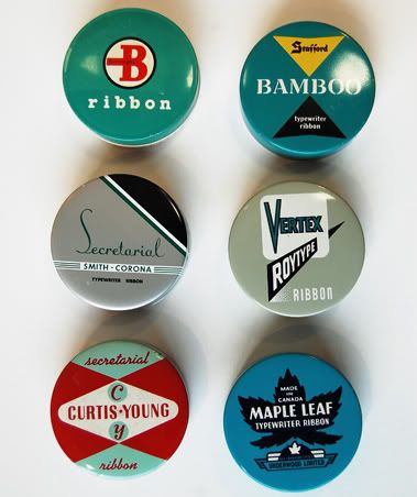
"Secretarial Silver"
Poppytalk, has asked Janine from the Uppercase Journal to share, and talk about, her modest collection of typewriter ribbon tins. They are all beautifully designed, and are in great condition. Great colors, typography, printing… just perfect. I wish I collected things that could fit so easily in one small box.
Here is a tiny preview, but you should really go look at them on their Flickr page. Nice big photographs of the entire lot.
Thursday, January 17, 2008
Whiteout, stray pencil marks . . .
 A while back, I wrote the introduction for a catalog that accompanied a Buenaventura Press gallery show held in San Diego. The show was titled "Original Comic Art" and was timed to open the weekend of Comicon, the massive superhero/pop culture convention. I post the essay -- on the subject of orginal art -- here for your enjoyment (or not).
The allure of an original work of comic art is hard to explain; unlike a 'fine art piece' it is in many ways an incomplete object, one intended neither for display nor for aesthetic appreciation. The artist will allow all manner of imperfections—whiteout, stray pencil marks, lettering lines, traces of changed text (are these evidence of a mistake, or a last minute substitution to achieve the perfect line of dialogue?)—knowing they will not be visible in the manufactured comic itself, the final realization of the artist’s vision.
And collecting original art can sometimes be a source of embarrassment, not unlike the queasy feeling you get (or should get) when amassing 'first appearances' or 'origin stories' of your favorite super-villains. To some, collecting implies an unhealthy obsession with notions of order, priority, and authenticity. It suggests a kind of symbolic regression—always ultimately unsatisfying—in which you unconsciously hope, by buying an 'original' or assembling a 'full run,' to return to, or at least achieve a simulacrum of, some prior state of psychological completeness, which never really existed. You can then say (with a feeling of satisfaction sadly short-lived), "I now possess every version."
In a paradoxical way, however, the appeal of a page of original art merges both a desire for the imperfect and a longing for the authentic. Like other 'originals,' such a page is unaltered by any contaminating method of reproduction (i.e., the ditto machine, or its offspring, the scanner). And yet, it is in part those above mentioned imperfections that make a page or cover so attractive; we experience pleasure while looking carefully at the slightly smudged Bristol board, noting the pencils that were left un-inked, identifying the differing densities of the brush lines, and searching for whiteout (the good pages always have some). It is a chance to gain a secret knowledge of the artist, who might otherwise remain inaccessible to us, hidden somewhere behind the reproduced page.
For the curators of this show, though, a page of original comic art is ultimately just art. The fact that it connects us back to a comic’s origins, while always interesting, is a secondary consideration. What matters most is this: is the page any good? And it is this quality—the aesthetic—that holds the show together. We have made no attempt to organize these works under any guiding principle; there is no defining school or movement (i.e., "Neo-Insincerity"), theme ("The Burgeoning Arena of Barbarian Art") or chronological limits ("Inky and Scratchy: Cartoon Punks of the New Millennium"). Instead, the show is a loose and happy mix of relative newcomers and established artists, aesthetic visionaries and scatological reactionaries, as well as peddlers of the cute and the perverse (quite a few fit into multiple categories). In other words, we have simply decided to show brilliant works by great artists.
Where possible, we have placed the final product—the comic—near the original page itself. There are no ideological reasons for this product placement (i.e. "to modify the aura surrounding the original qua original by contextualizing it in proximity to its latter instantiation"). We simply thought it might be educational and fun to see them together.
So we recommend that you return to Comicon, sell (at an impressive profit, naturally) the multiple investment copies of Leotard League #1 hoarded in your youth, and purchase some of this amazing, one-of-a-kind art. This show gives you the chance not only to see up close the mysteries each piece reveals, but to secure sole possession of these wonders.
Direct (almost) from the ink-stained hands of the artiste into the grubby paws of you, the collector—with only a modest cut going to us as 'facilitators'—we offer you Original Comic Art.
Wednesday, January 16, 2008
Werewolf by Night
If you are going to be performing in Zaire, you will need something to read on the plane.
![]()
Monday, January 14, 2008
Let's go below the border for some South American jive!
For 61 flavors of Tico Tico, visit WFMU.
For more of Ms. Smith…
These scenes are taken from the MGM film from 1944 Bathing Beauty.
Bonus: Update on the whereabouts of that Hammond. And, Ms. Smith herself. Look at that incredible signature!
Sunday, January 13, 2008
Tomine / New York Times

Today's New York Times Magazine (1/13) has a cover by Adrian Tomine. The feature story on morality also includes some large color illustrations by the cartoonist.
Friday, January 11, 2008
Wednesday, January 9, 2008
Reading Samson by a tree.
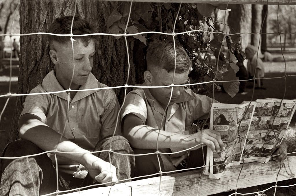
From Shorpy–July 1941. Youngsters at the Fourth of July picnic in Vale, Oregon. 35mm nitrate negative by Russell Lee for the Farm Security Administration. Click the image to view a larger scan of this photo.
Reading: Fantastic Comics. Not sure which issue. Hopefully that one features a Stardust story.

Reading: Fantastic Comics. Not sure which issue. Hopefully that one features a Stardust story.
Tuesday, January 8, 2008
Monday, January 7, 2008
The Book of Other People
 Penguin has just released Zadie Smith's The Book of Other People, a collection of short stories. It's of special interest to comics readers: the book's cover is designed by Darren Haggar and features 12 profile portraits by Charles Burns (one from the back cover is shown above), and it has new stories by Daniel Clowes and Chris Ware.
A panel from Clowes's "Justin M. Damiano": A panel from Ware's "Jordan Wellington Lint":
Trick Out Your Hoopty
Recognizing that many of us are discomfitted by the rigors of brand compliance at least to the extent of preferring one trademark to another, these are merely two examples to get you started. They feature Wally Gropius, Teen Millionaire--in usage since 2005.

![]()
Saturday, January 5, 2008
R. Crumb's Underground

I curated this big retrospective exhibition "R. Crumb's Underground," which ran at the Yerba Buena Center for the Arts in San Francisco last March-July, and is now traveling to the Frye Art Museum in Seattle, opening January 26. Alvin posted these Yerba Buena pre-opening installation shots on his website during the original run, but here they are again for anyone who didn't see them... it also might be of interest for some of the folks who see the show in Seattle to compare and contrast.
I spent the week leading up to the opening in San Francisco working with all the great people at the museum on the installation, and I was really proud of how it turned out. It's always tricky working on these comic exhibitions--there's a great deal of responsibility to remain true to the work, while providing a historical/cultural context, as well as bearing witness to the process the originals go through in their functional life. So wall labels must provide a sound framework and lay out organizing thematic principles--without dictating terms. And photos, printed material, roughs, videos, and the like need to deepen the impact while not creating a linear cause and effect/connect the dots dynamic that can become way too overbearing. The proper balance is fine indeed, and you ultimately have to know how to step back and let the art speak for itself: it's of the utmost importance to create a respectful environment for the work and make sure the presentation and background you've devised are intellectually responsible, but then by all means get out of the way (I get the sneaking suspicion that many curators think the work on display is little more than clip art to shuffle around in composition of their grand artistic statement).
Anyway, this show in its SF incarnation was the most successful I've ever worked on at navigating these issues, and it was some fun. I can't make it out to Seattle to help with the installation this time, but I'm sure it'll be just as mind-bending there--we managed to secure an embarrassment of riches from many generous private collectors, galleries, and the man himself, so it'd honestly be sort of tough to go wrong--close to 200 originals (mostly ink on paper, 'natch, but also paintings and sculpture), with tons of your favorites as well as some true surprises. The show spans the homemade comics Mr. Crumb did with brother Charles when they were kids all the way to work from the last few years (including many collaborations), with an emphasis on the world-changing late '60s comics and sketchbooks.
R. Crumb's Underground at the Frye
Oh, and I visited Robert and Aline and interviewed them for an "audio tour" that accompanies the exhibition, so don't miss out on hearing their great stories. The show will head to the Institute of Contemporary Art, Philadelphia late this year, so maybe some of you East coasters can also check it out. If the folks at the Frye are okay with it, I'll post my wall texts later in case anyone who can't see the show would care to read them.
Thursday, January 3, 2008
Oxnard Boulevard at 4th Street
My wife Yoshiko's parents live in Oxnard, California, an hour outside of Los Angeles. They own a market in neighboring Saticoy where the freeway used to go. Oxnard used to be a small farming town. Yoshiko has often said her fellow high school graduates were bound for the military. The city barely has a skyline, one medium tall office building visible from the freeway. Over the years that we have driven up to visit though, it has become overdeveloped; where used to be farmlands ten years ago are now long stretches of strip malls and factory outlets.
Oxnard is also where the Hernandez brothers grew up, and I've often been struck by how the town appears to have seeped ineffably into their kinesthetic backdrop vocabulary. The ranch style houses found in Jaime's and Gilbert's panels can still be found on blocks where they haven't been replaced by new condos. On our most recent visit though, I would not have known that we had driven by where Rolly's Restaurant, pictured below, used to be if Yoshiko had not told me.

![]()
Subscribe to:
Posts (Atom)
