 NOTE: For a recent post by me on the book version of Wally Gropius, please see here
.
Around a month ago, cartoonist Dash Shaw put up a
nice post at Comics Comics about cartoonist and Blog-Flumer
Tim Hensley. Dash notes that “It’s like what [Tim] chooses to draw in the environment (and what he chooses not to draw) is determined by some graphic Feng Shui.” This is an astute observation, and I think there might be something going on in addition to Feng Shui.
It makes sense that Tim’s Wally Gropius (which recently concluded its serialization in Mome) should take such an interest in interior and exterior spaces, given that the comic’s title references Bauhaus architect Walter Gropius. But rather than look primarily to architectural history, Tim’s sense of space seems to reference (and he can certainly correct me on this) a fundamental conceit of children’s humor comics of the mid-to-late 20th century.
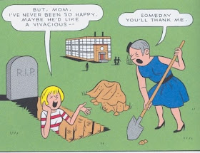
This Little Lulu cover represents this minimalist conceit:
 It features only the characters and objects necessary for the gag –- and they appear almost to be suspended in space. Like these covers, Hensley's approach in Gropius is to redefine and often erase the boundaries that separates interior and exterior -- and distinct dimensions in reality are replaced by a continuous field of color in his comic.


 Tim’s cover for the latest issue of Comic Art (#9) follows in this tradition (especially prevalent on Dell and Harvey covers), with its off-kilter take on funny animal gags:
 In this panel from “The Dropouts in 'Virgin Vinyl'” (Mome Winter 2007), a section of Wally Gropius, Tim includes only the scene's characters and objects related to the story’s running gags, echoing the above covers' minimalist take on space and humor:
 Here the teen romance/sexual frustration theme is visible in Wally’s romantic excitement and lack of focus: he plugs his guitar into the Ficus instead of the amp. Perhaps this gag also suggests sexual frustration in a coded way –- the position of the guitar and the fact that the cord is plugged into the plant (fertility?) as a kind of sexually suggestive act. The other objects that appear in the panel -- the hammer and the piggy bank (‘breaking the bank’) clearly relate to the Richie Rich-esque money puns that run throughout the story –- and the future aggression implied in the pairing of these objects next to each other (eventually the bank [as in Jillian Banks, Wally's love interest?] will be 'broken') might relate to things yet to happen in the story, and one extremely chilling scene in particular.
Almost every panel on this page is set up in a way similar to the children's comics' covers:
 Note the surreal shadows in the last panel . . . And in the whiteness of this panel we see a potential blurring of inside and outside. Are they inside a garage -- The Dropouts as a literal "garage band" -- yet an armored car appears in the far distance . . . If this an interior space, it's vast . . . Also note the way that blocks of color organize the page's design (as do, in a different sense, the money-related objects that appear in each panel). Tim's approach to space allows his coloring ability to occupy center stage and to emphasize the panel in a new way.
[What's the pun on Greenspan and the saw in the first panel? "Saw + bucks" -- sawbucks as slang for a $10 bill?]
Exteriors often use the same approach, as in these panels from “Gropius Besieged” (Mome Summer 2009). Just as there is no distinction in many of the ‘interiors’ between floors, walls, and ceiling, the field of color redefines exterior space by eliminating any clear distinction between ground and atmosphere:
 Given the strangeness of the environment, the shadows (here and in the above panels) appear to be an odd relic imported from 'reality,' reflecting a more conventional approach to delineating space. . . . And even the different kinds of shadows in the two panels suggest Tim's original approach to environments.
This panel -- a scene in Jillian's bedroom where closets and the door 'f'loat' in space yet are realistically positioned -- puns on the fact that cartoon characters in these kinds of comics always wear the same outfit, day after day:
 Gropius is dense with such puns, and Tim’s approach to space is like one ever-present -- albeit abstract -- beautiful pun. I can’t think of another cartoonist who approaches space -- and what we might call 'spatial color' -- in such a rigorously strange way. As Dash observes, there's a real logic to Tim's work.
 Wally Gropius and Walter Gropius --
Fagus Works (1911-13):

 Monument to the March Dead (1921):


For some of Tim's Gropius related posts on Blog Flume, see the following: 1, 2, 3, 4, 5, 6.


